Australian Shareholders' Association
Australian Shareholders' Association
Finding strength in clarity
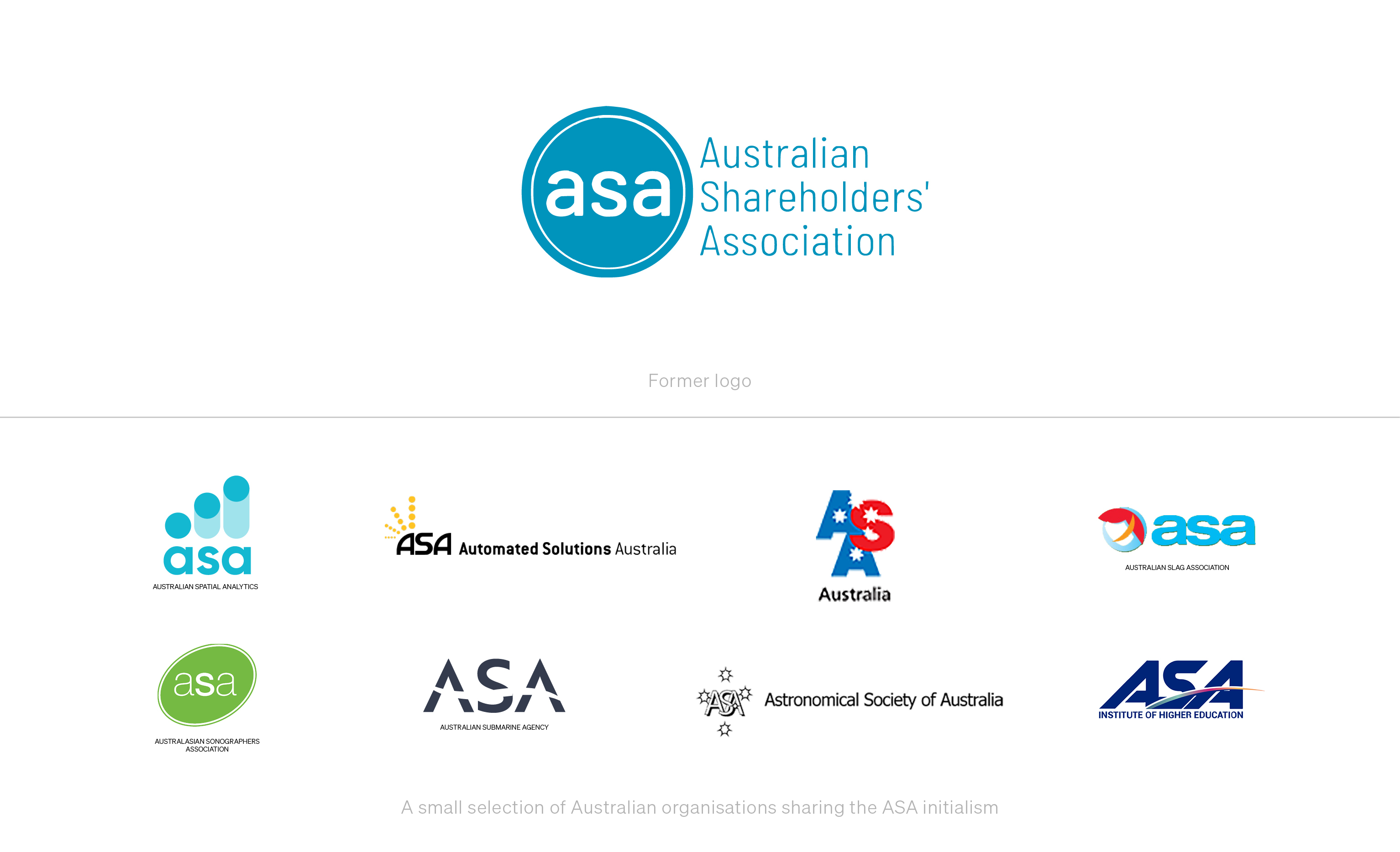
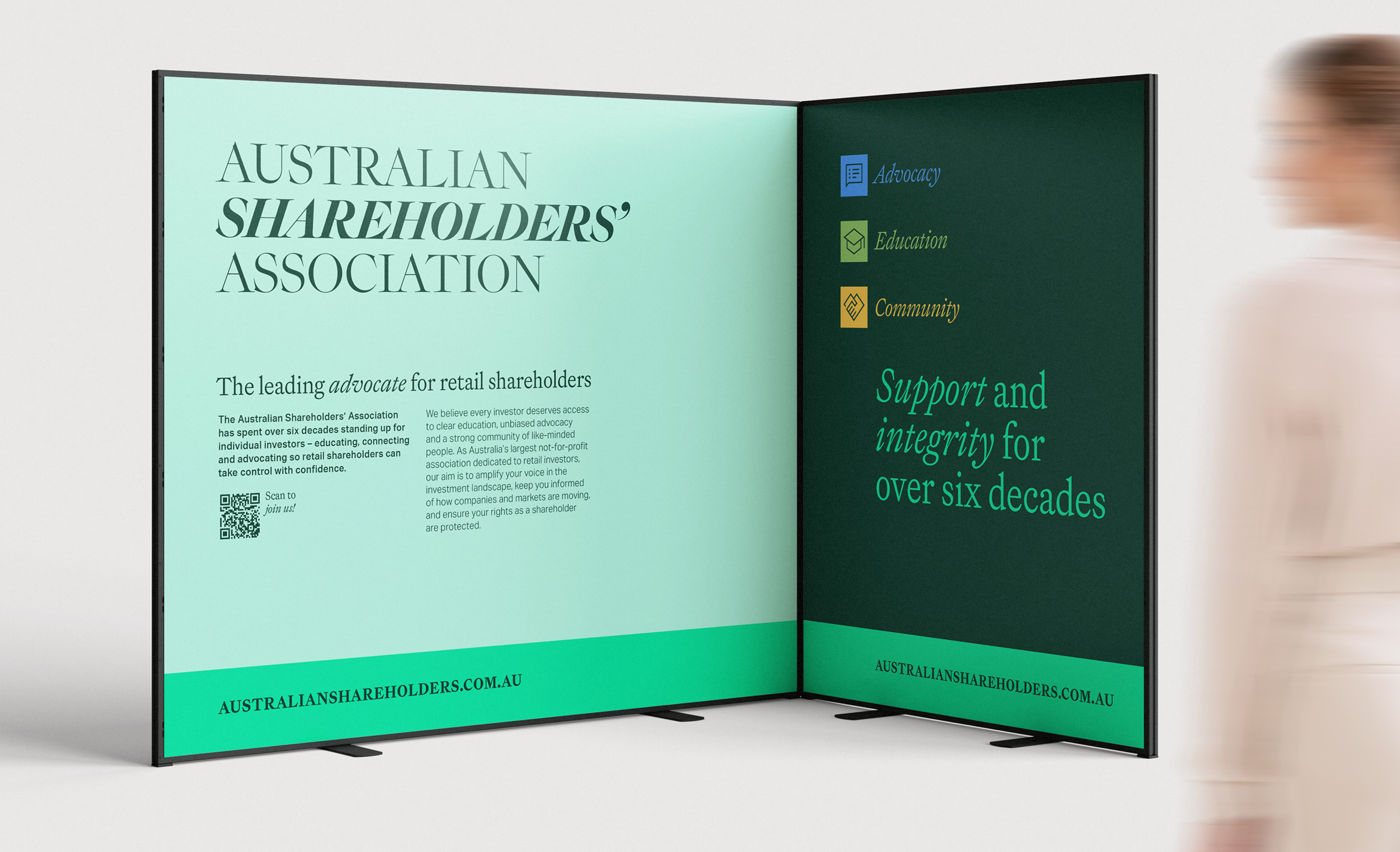
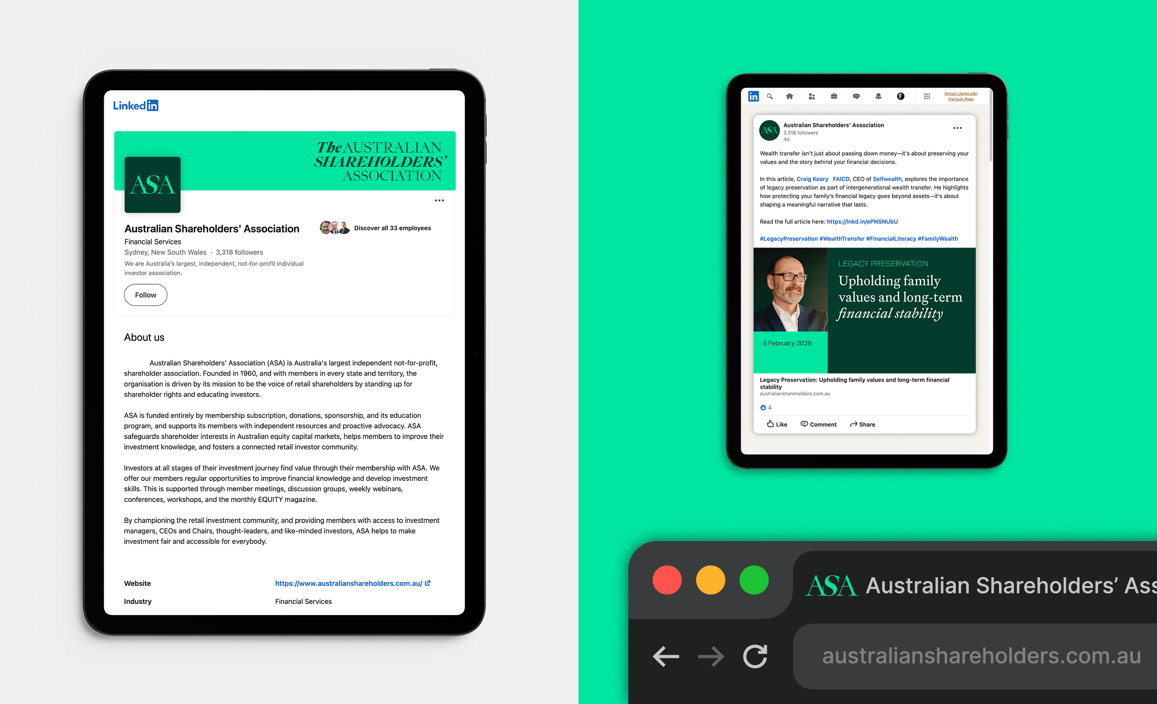
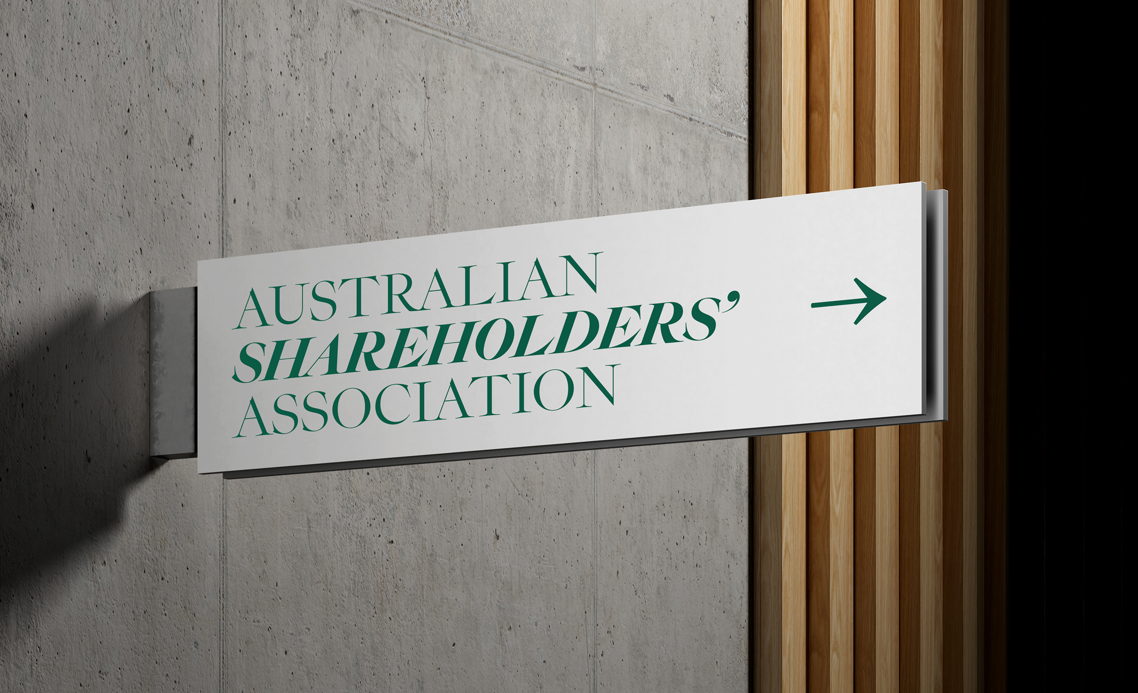
The Australian Shareholders' Association wanted to strengthen its voice and sharpen its focus. Membership was not reflecting the size of the retail investor market, and its understated ‘asa’ monogram mark was easily lost among other ‘ASAs’. Meanwhile debate about expanding appeal from ‘shareholders’ to ‘investors’ risked clouding its positioning.
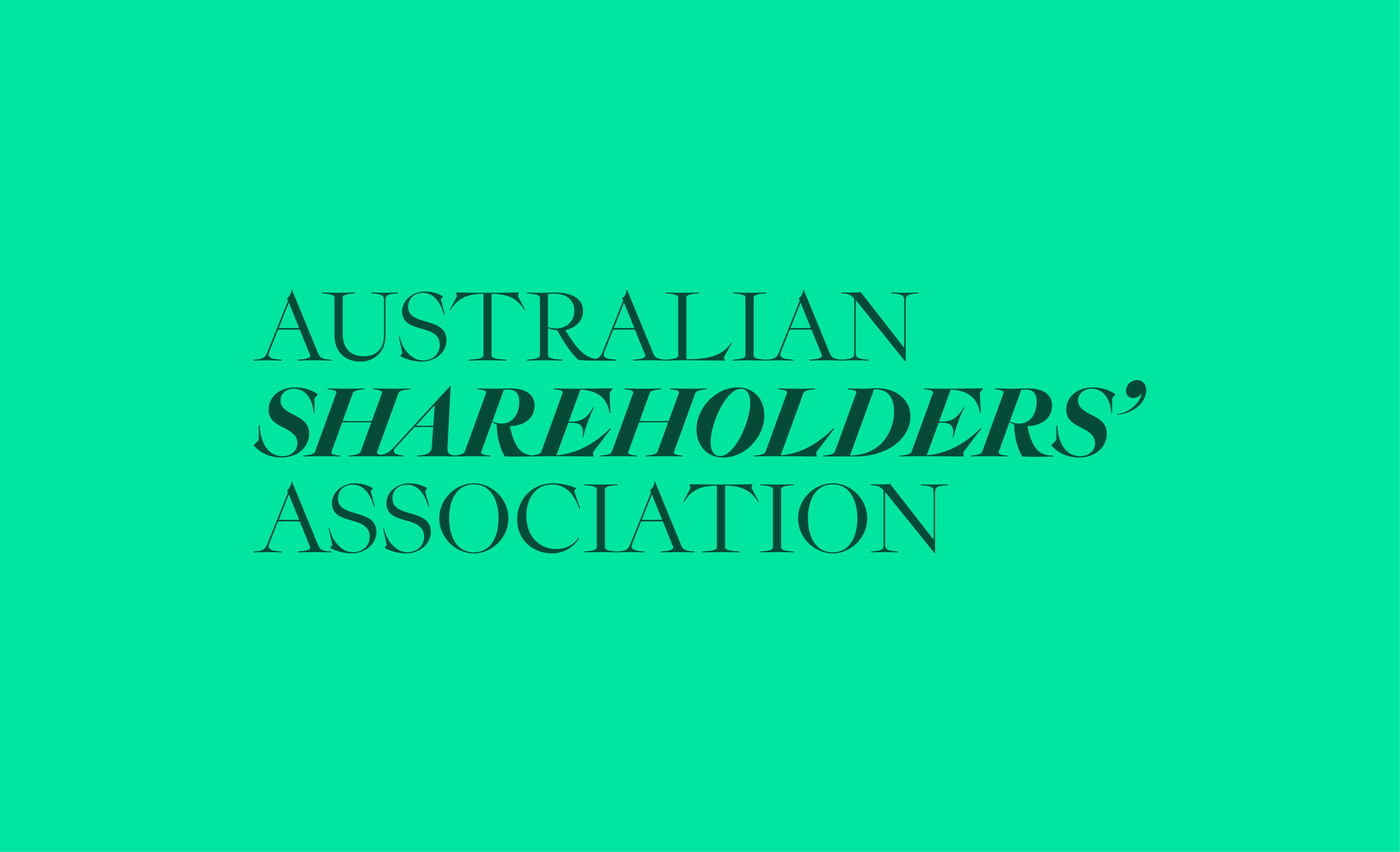
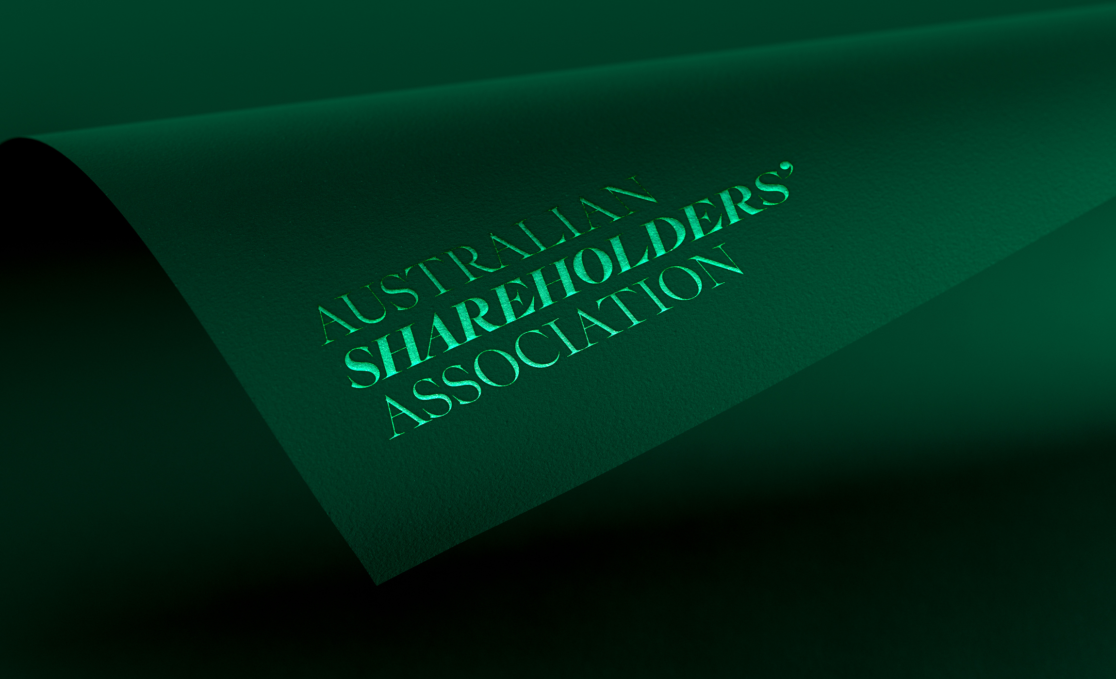
Saturday's strategic recommendation challenged this thinking: don't dilute your focus – dial it up. With current membership at barely 1% of all listed company shareholders in Australia the opportunity to own a singular, unique and compelling position was clear. Our solution: embrace your full name and declare exactly what you stand for. A bold, contemporary wordmark reinforces that confidence – one voice, one association, representing the best interests of every individual Australian shareholder and holding powerful corporate boardrooms to account.
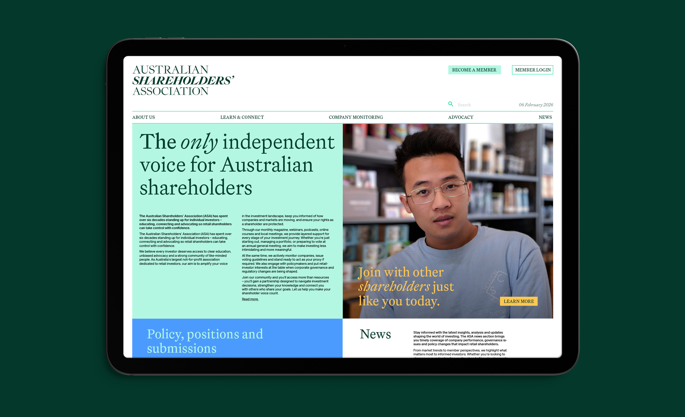
Rather than chasing a broader audience, the refreshed visual identity and assertive narrative sharpens the Association's unique value. The result is a compelling membership proposition that no other organisation can claim, positioning the Australian Shareholders' Association for growth through absolute clarity of purpose.