Hiway
Hiway
Leading the way
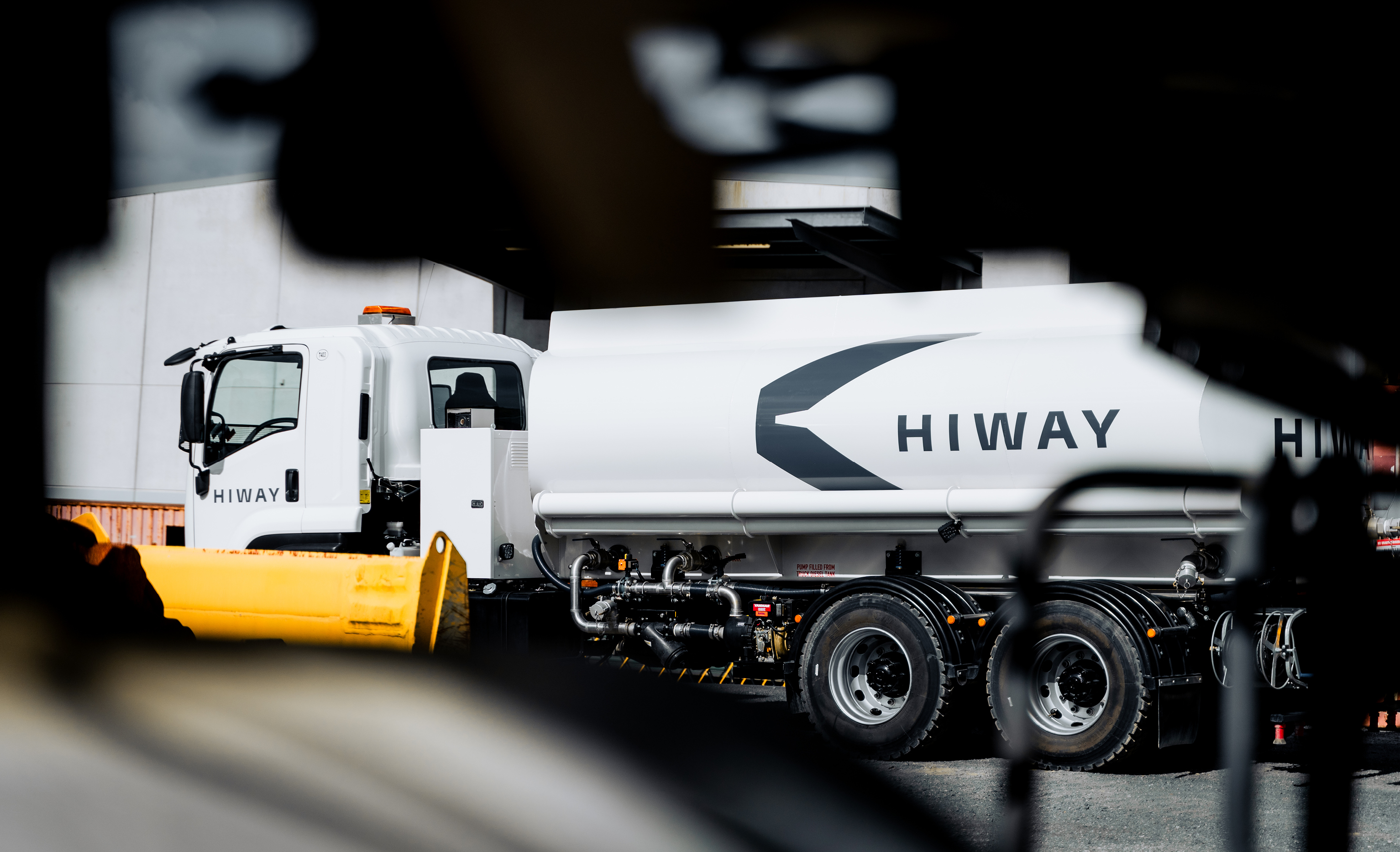
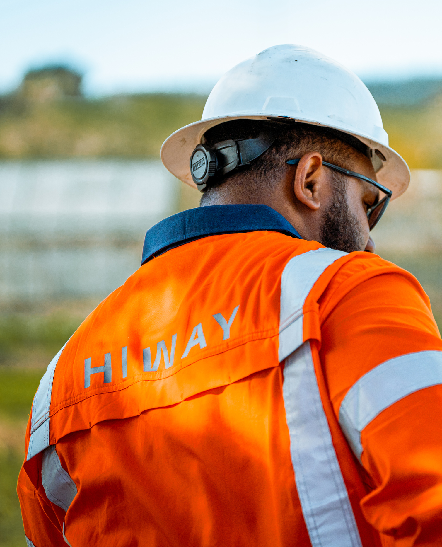
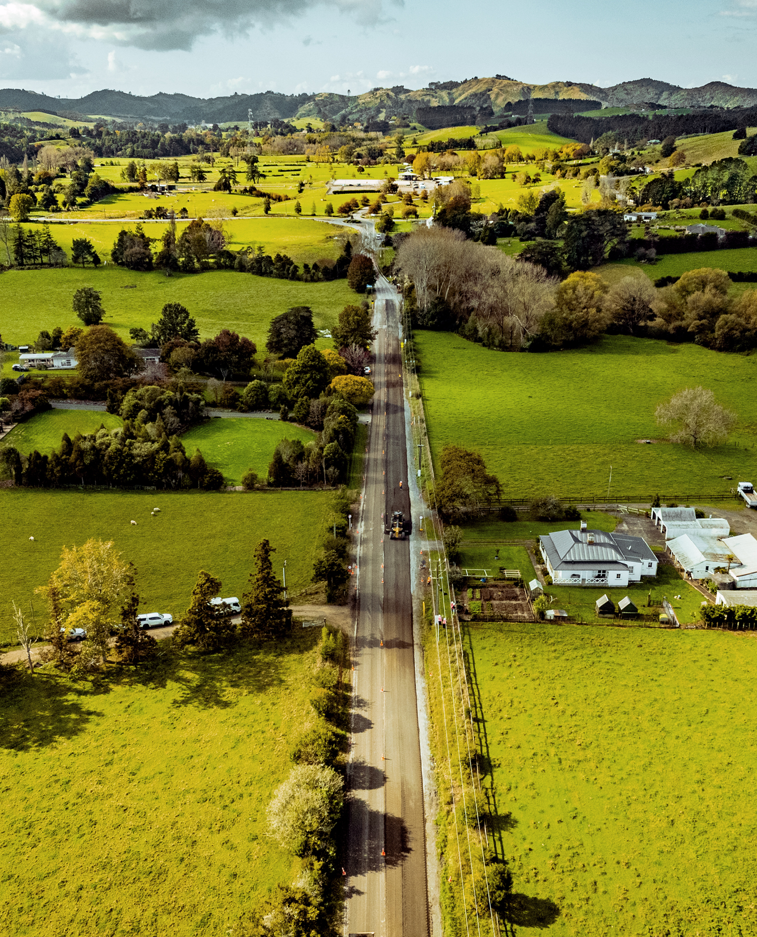
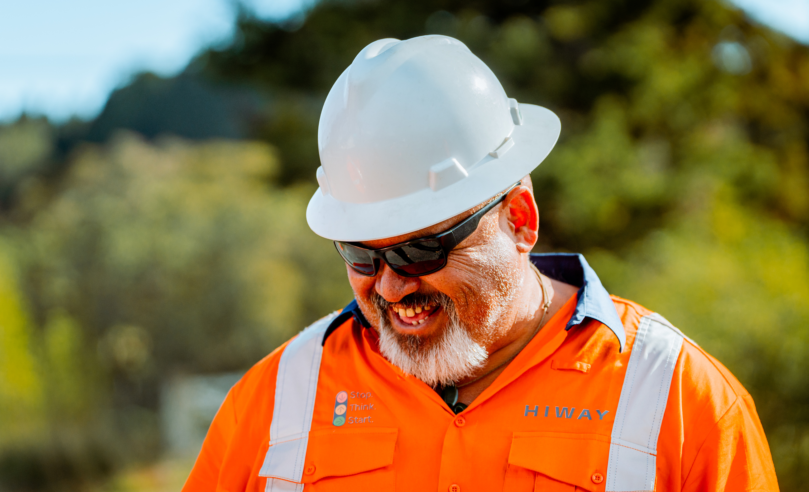
Hiway is a specialist partner in Australasia’s roading infrastructure ecology. Through in-situ recycling, reuse and enhancement of existing materials, they substantially reduce emissions, extracting less from the environment and minimising disruption and cost. Hiway is the leader in this field, but after nearly four decades of operation and acquisitional growth, the brand had become fragmented with multiple sub-divisions across a vast geographical network. Coinciding with a decision to bring everything together under one name, Hiway approached us to revitalise the brand and truly reflect their purpose.
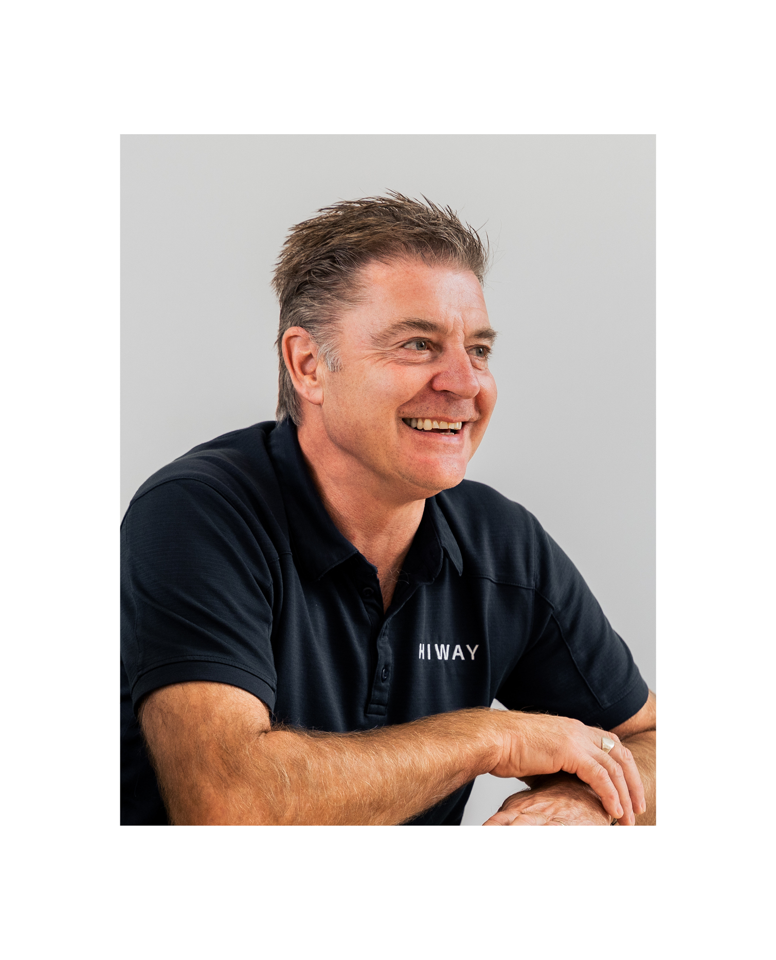
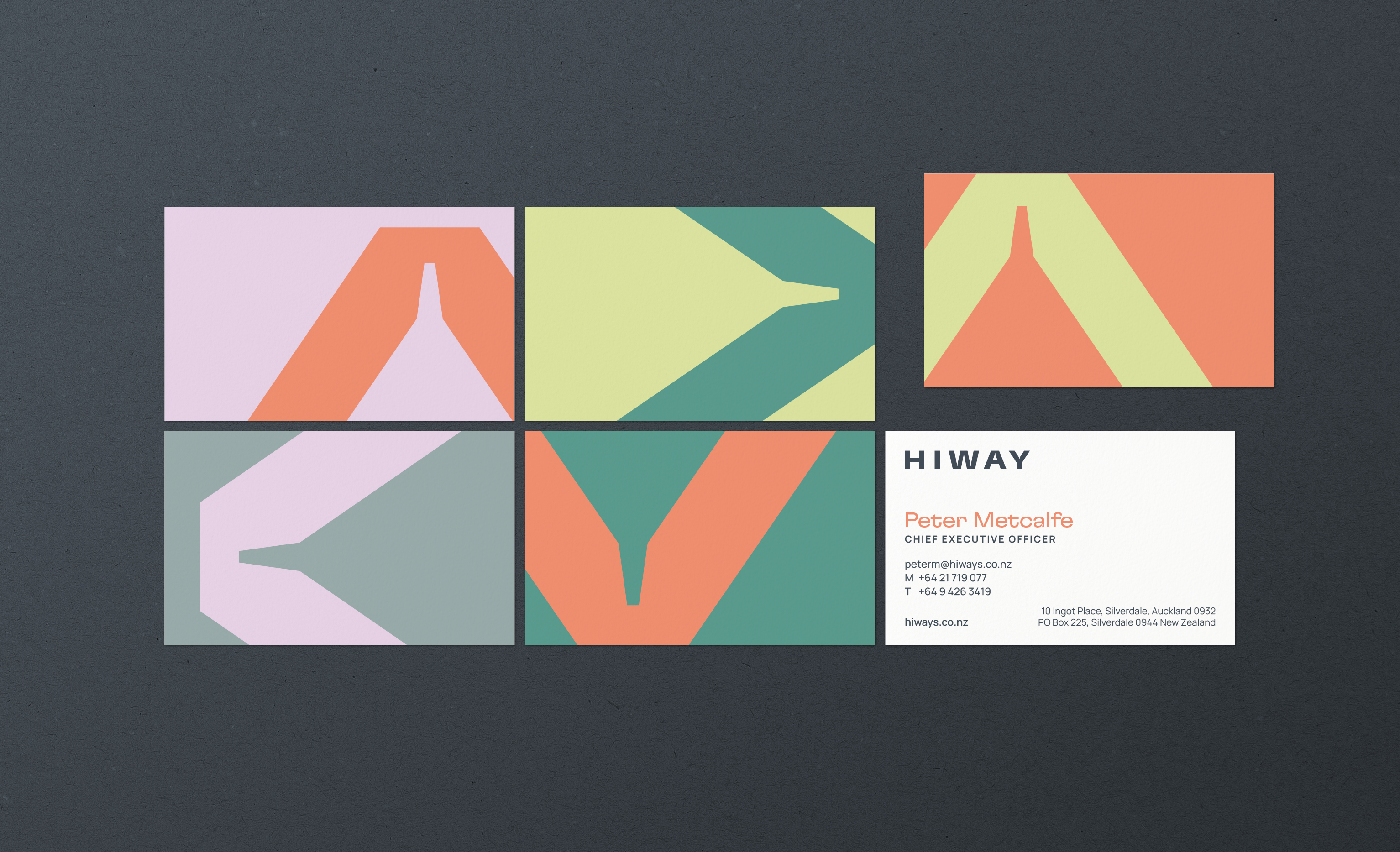
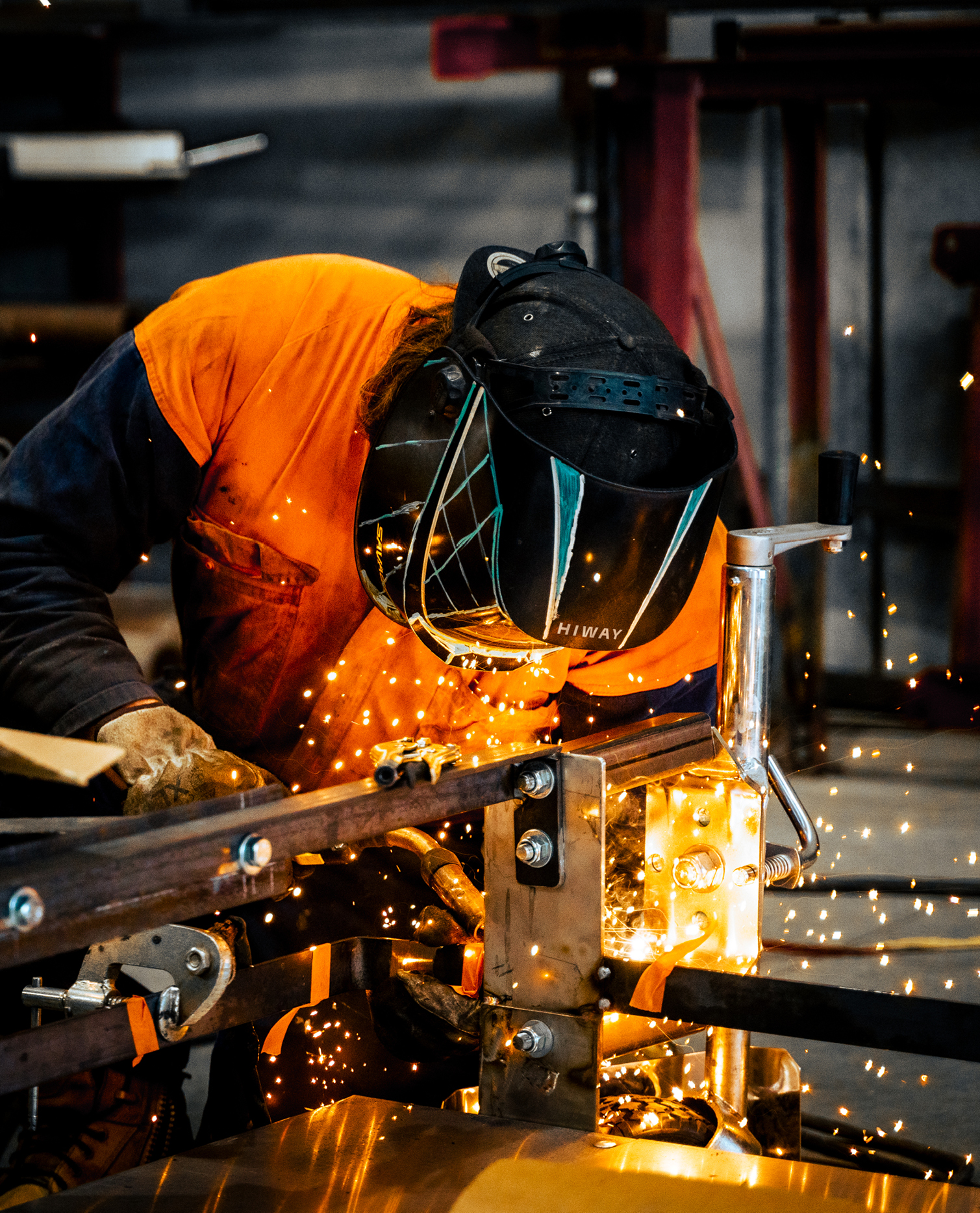
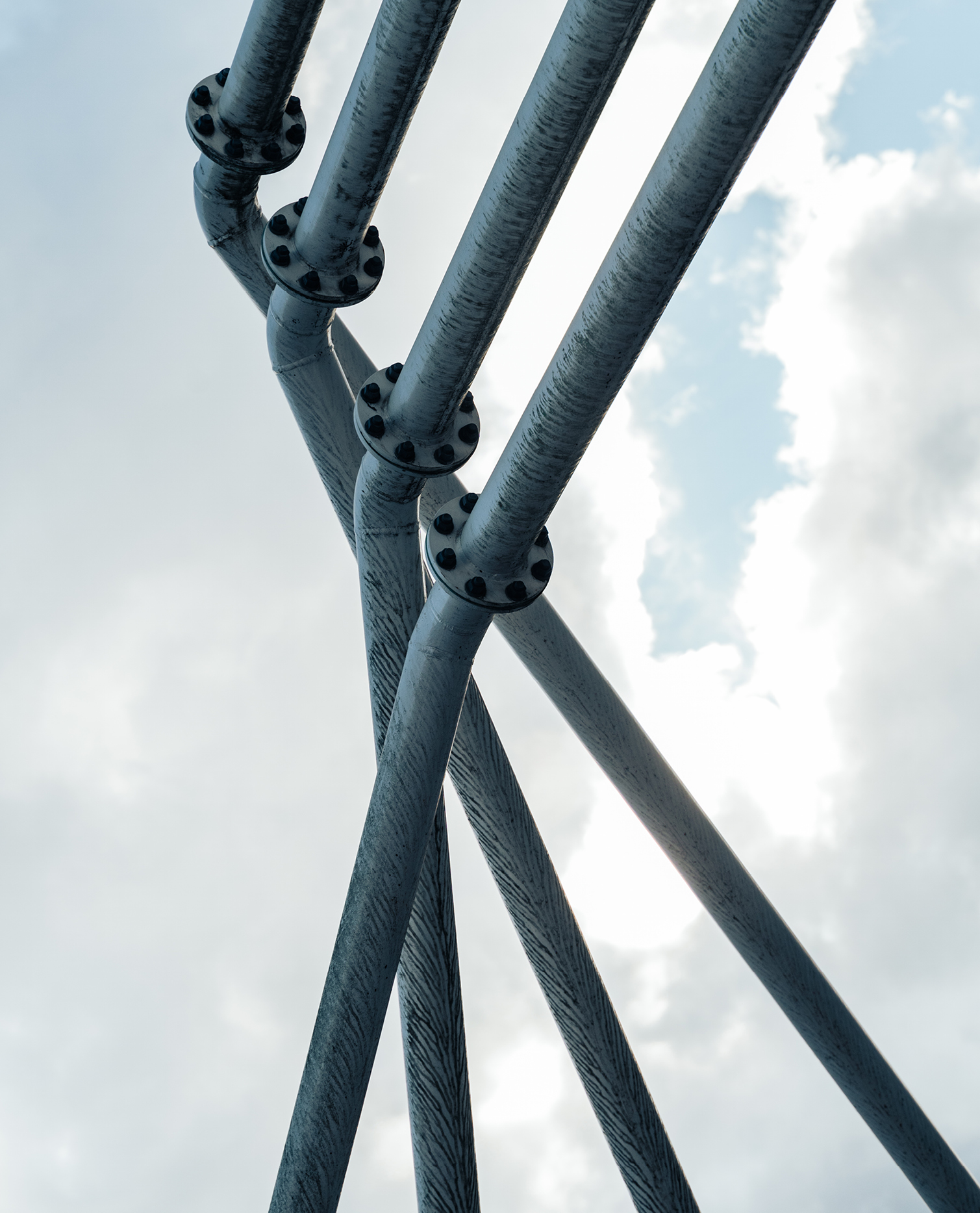
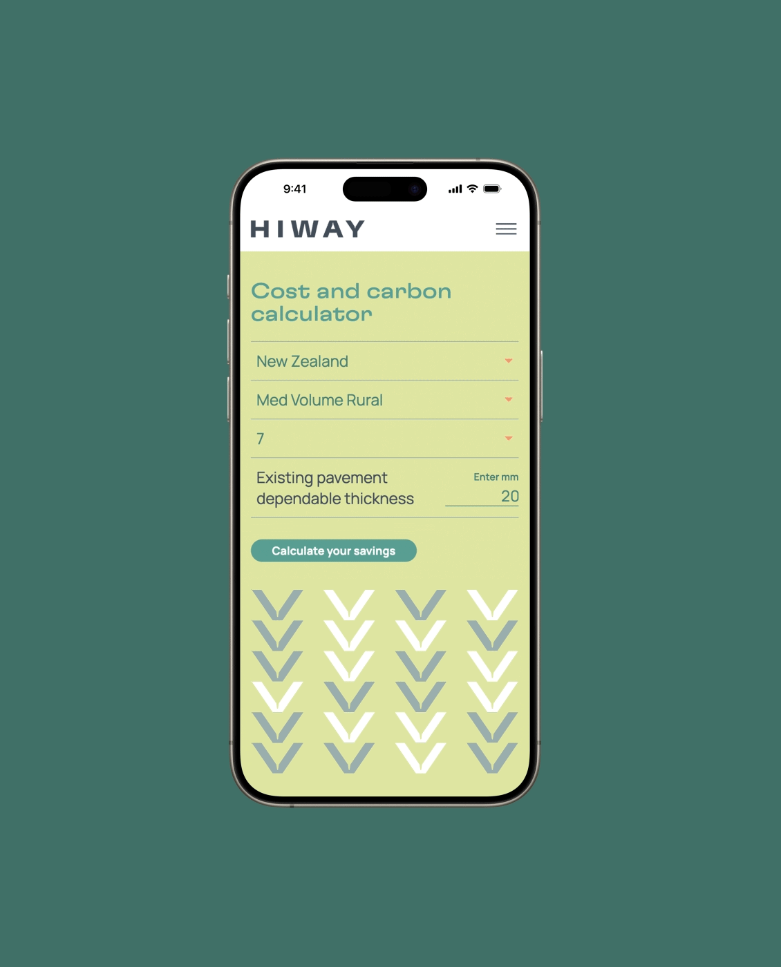
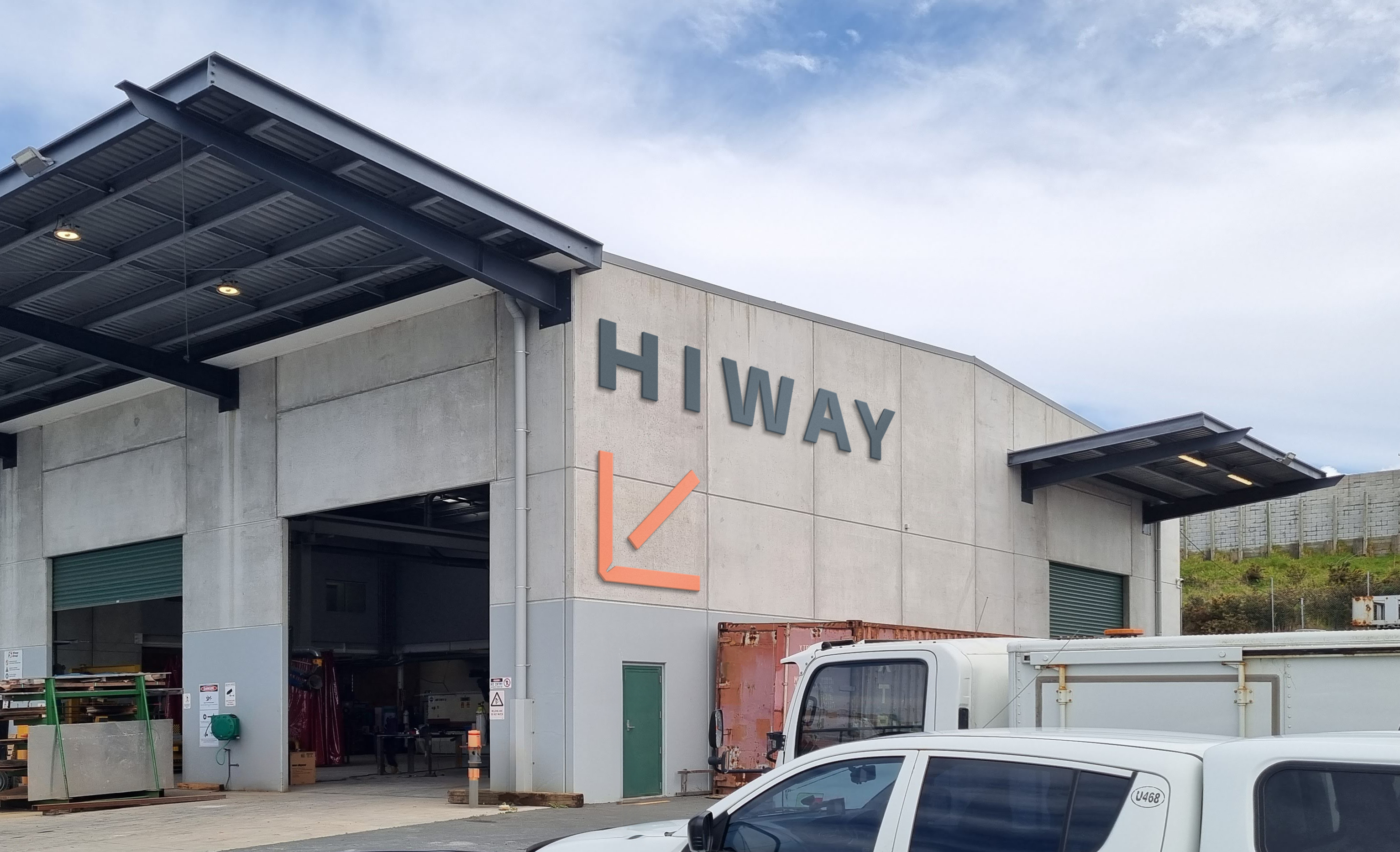
Our trans-Tasman stakeholder research revealed an opportunity to shift the narrative from the functional process of recycling roads to one of purpose and reducing the continent’s carbon footprint. We show the optimism of a more sustainable way, standing out in the sector with bold, fresh colour and human-centric typography. The expansive logo gives a sense of stability, while refined details indicate technical precision. New photography seeks out defined shapes in materials and machinery, alongside the blend of intelligence and warmth that characterises the company’s culture.
The new brand signifies a more balanced and carbon-conscious future for our transport networks — sustaining our environment and, in turn, sustaining our communities.
“We’re a 35-year-old player in Australasia’s transport infrastructure having established a strong reputation for excellence in stabilising and recycling roads. We needed to reorientate our company for a future increasingly concerned with environmental sustainability. Saturday helped us to discover a fresh narrative that not only lifted us from process to purpose but also united our group into a singular trans-Tasman brand. Their strategic and thorough approach was widely consultative and commercially pragmatic – they got us and were a joy to work with. We are delighted with our new identity. Its future-leaning and sustainable perspective gives our brand focus, confidence, and positions us well as a strategic partner in the wider transport infrastructure ecology.”
Peter Metcalfe, CEO, Hiway