Prochaine
Prochaine
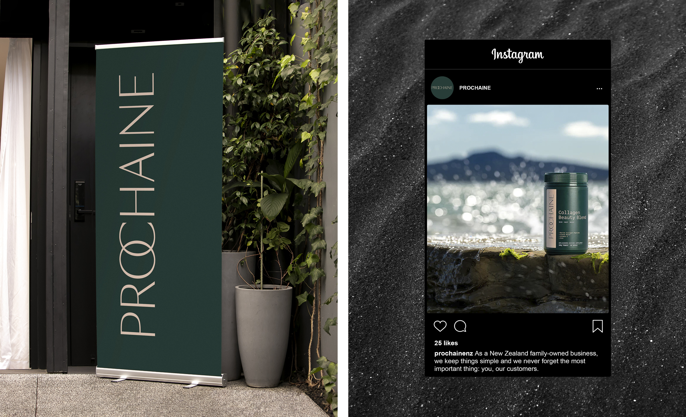
Branding the science of good health and beauty
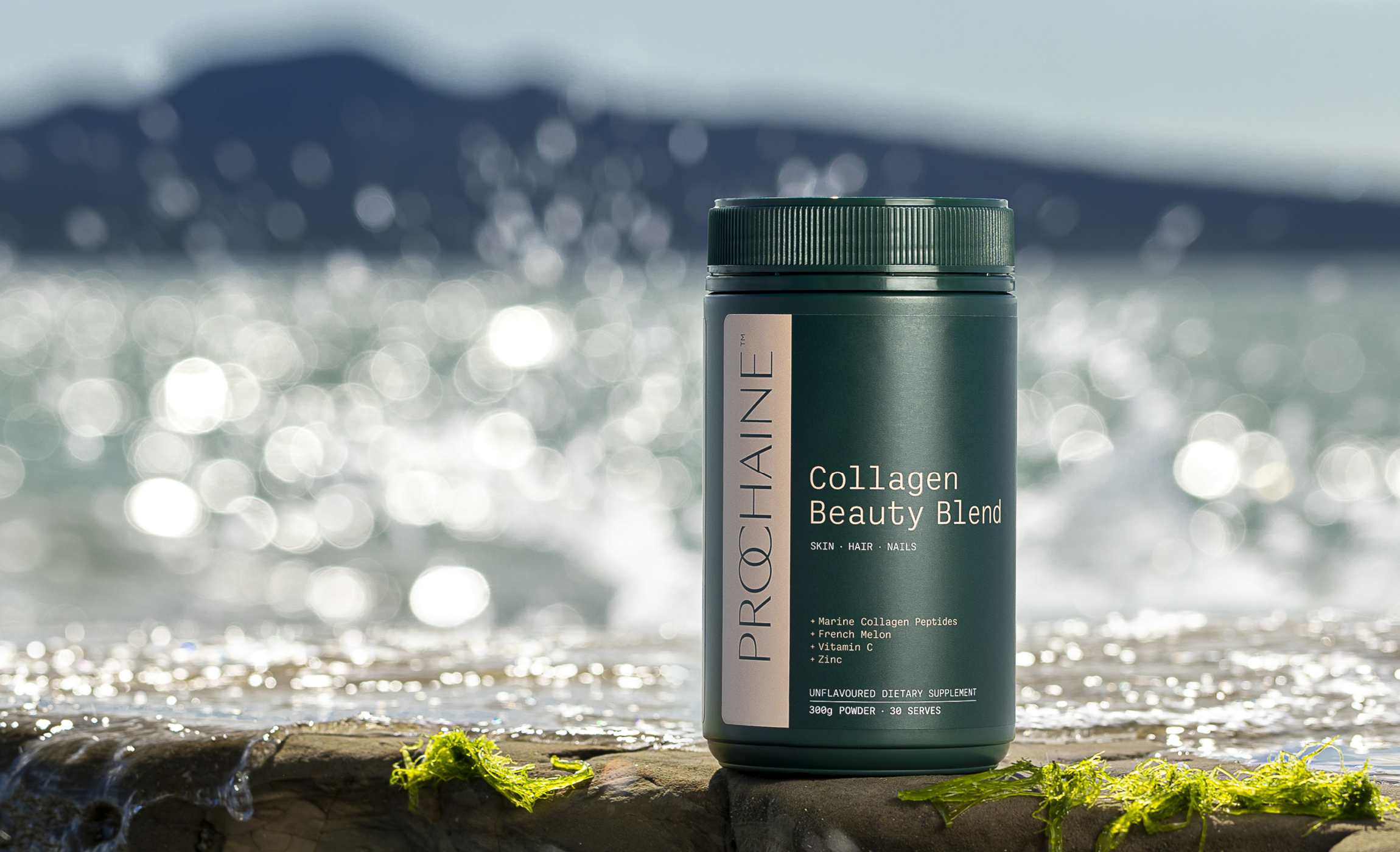
Mitchell Weston Nutrition briefed us to develop an identity and packaging system for Prochaine, a new range of health supplements. Meaning ‘next’ in French, Prochaine needed to feel contemporary, clean and simple without being clinical.
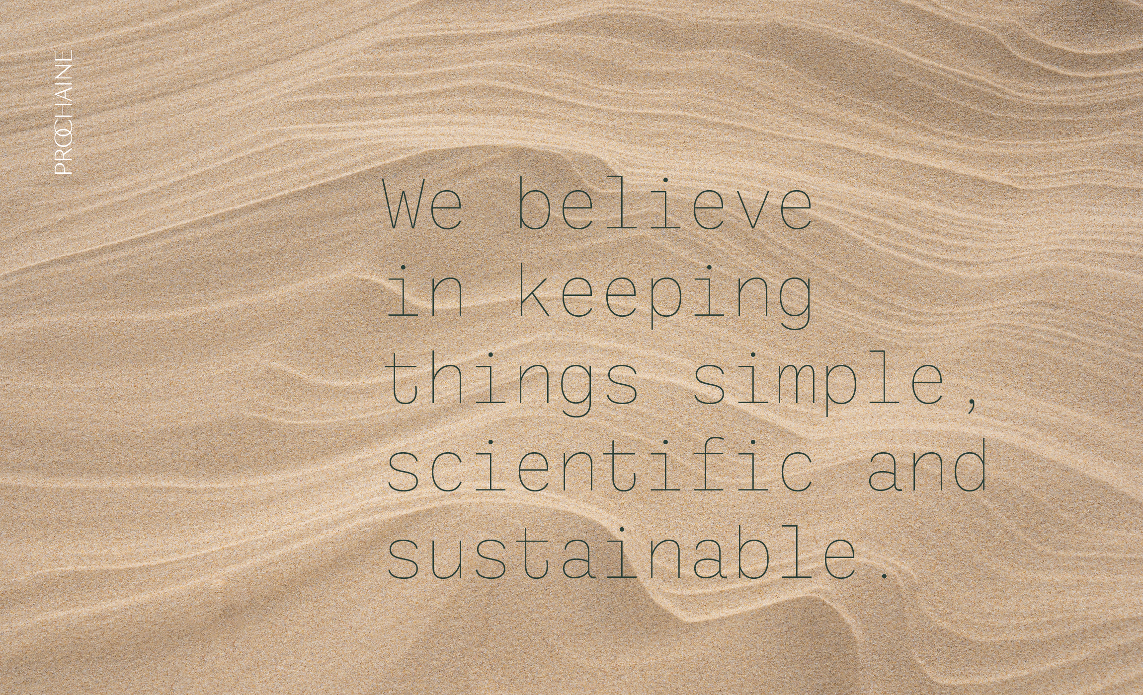
Following extensive research into other supplement brands, we helped define the strategic direction and narrative for the Prochaine brand with the belief that the brand should be simple, scientific and sustainable.
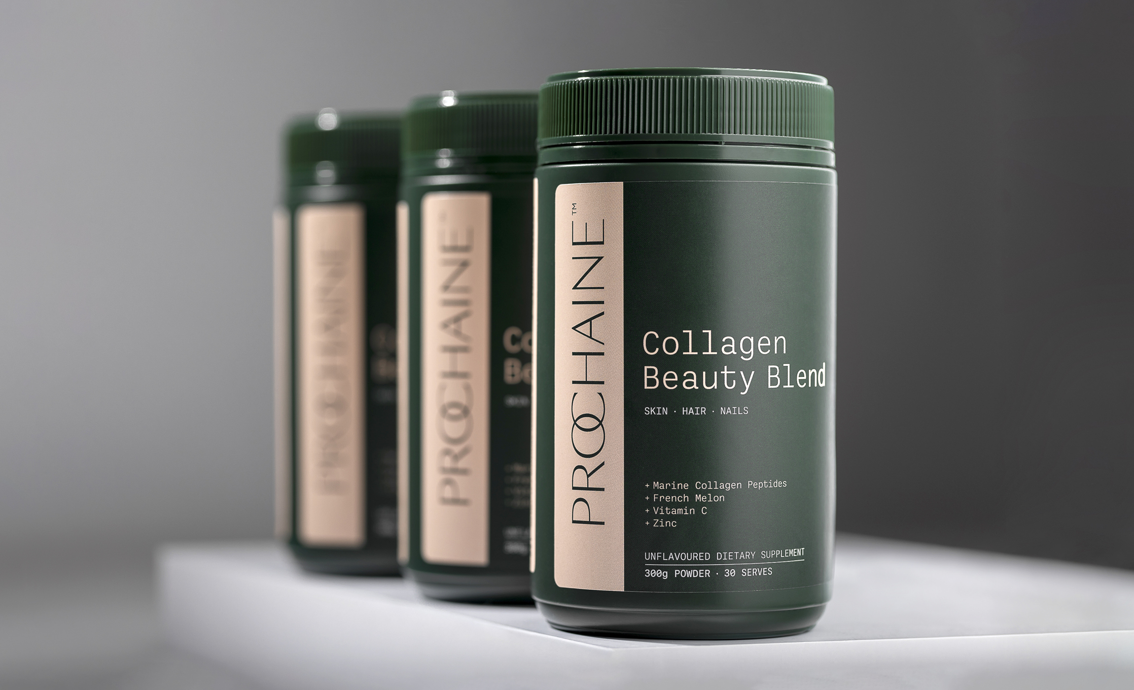
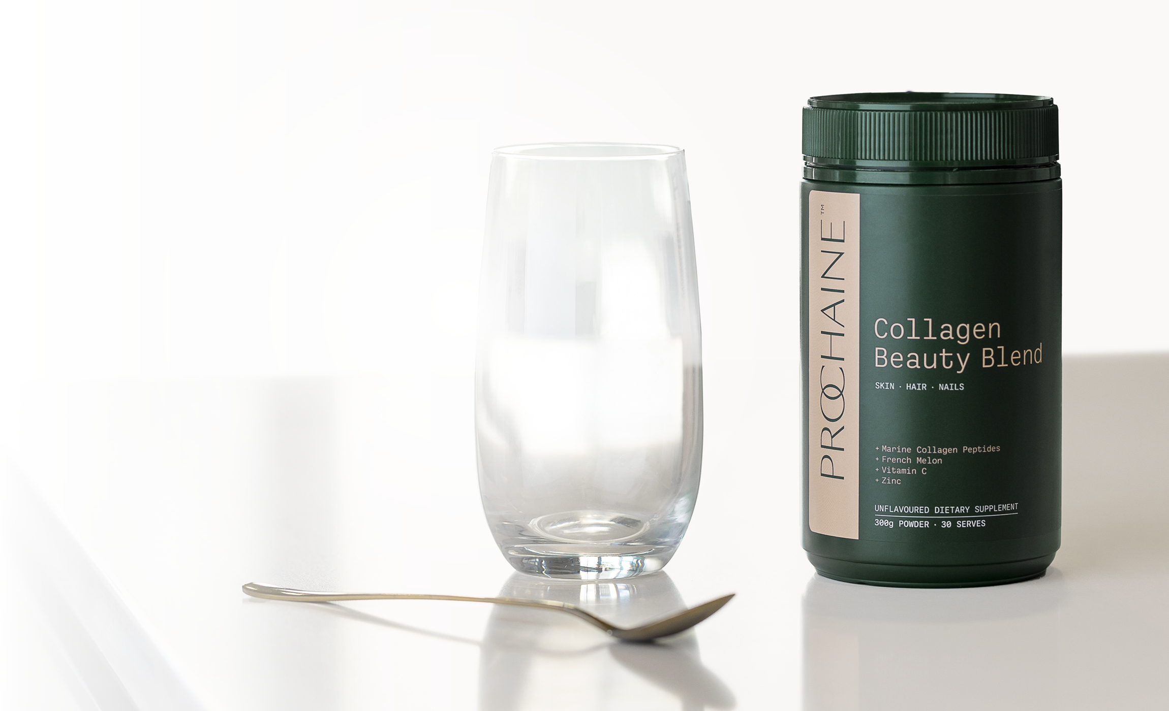
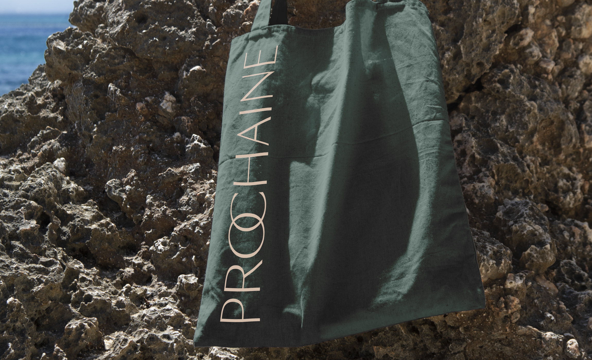
The custom wordmark signifies the harmony of science and nature through finely balanced typography, merging classical elegance and modern simplicity. Complemented by a colour palette which is both natural and calming, the flexible packaging system was developed not only for the first collagen product but to extend to a larger holistic range of future products. The information architecture is presented clearly without excesses, allowing the balanced and elementary ingredients to remain at the forefront.
Special mention to:
Ida Larssen White Lynx and Mareea Vegas – Photography
Red McLeod – Videography