Carl's Jr.
Carl's Jr.
Flipping brands
Another red, yellow and white burger brand, anyone? As the fourth player into New Zealand, Carl’s Jr. needed to make a more compelling connection. The trend towards ‘fast casual’ (vs. just fast) burger dining compounded the challenge.
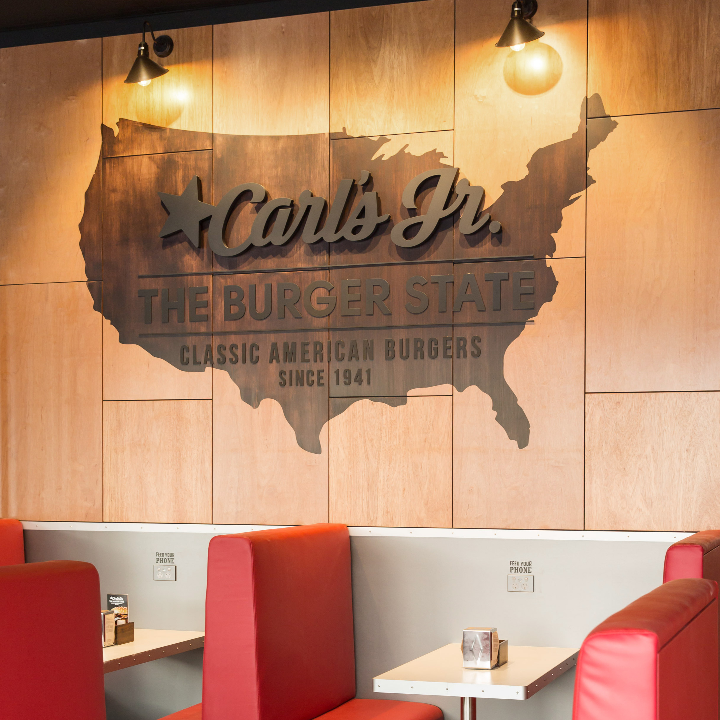
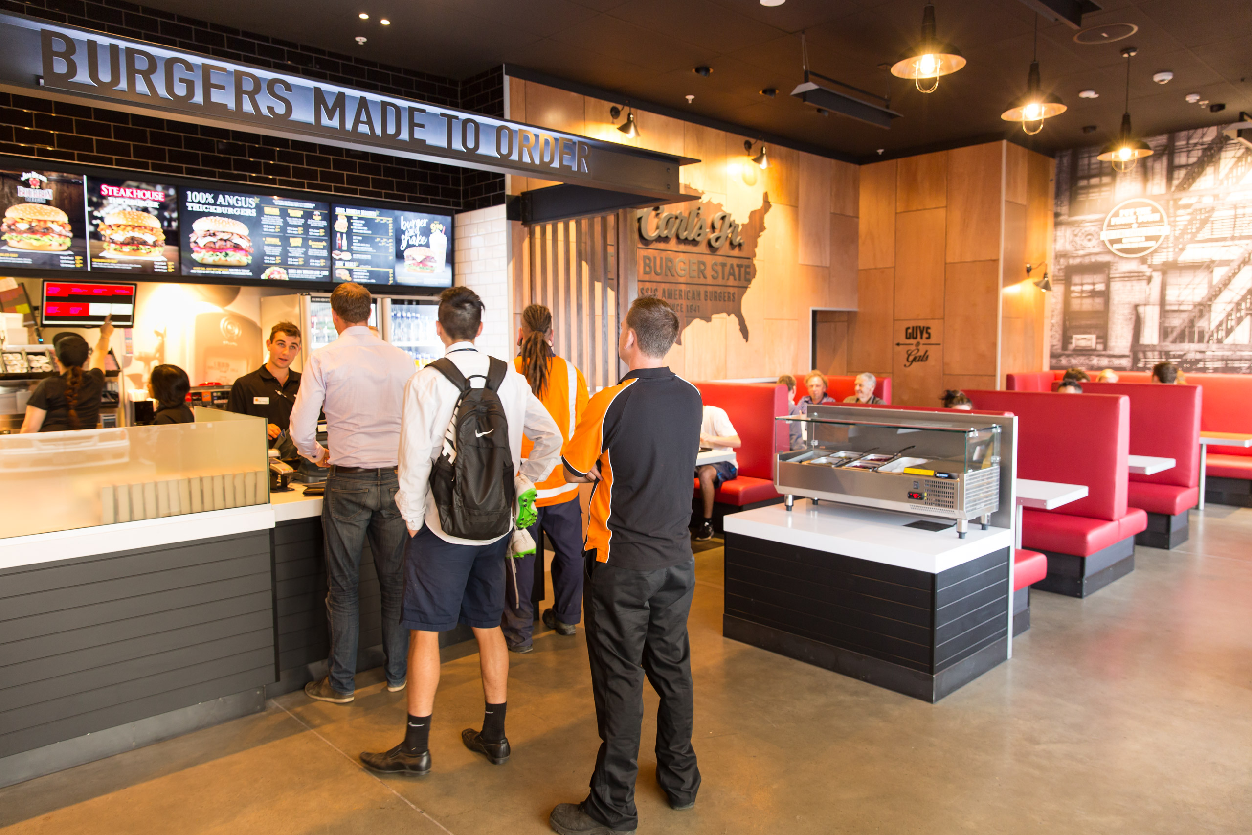
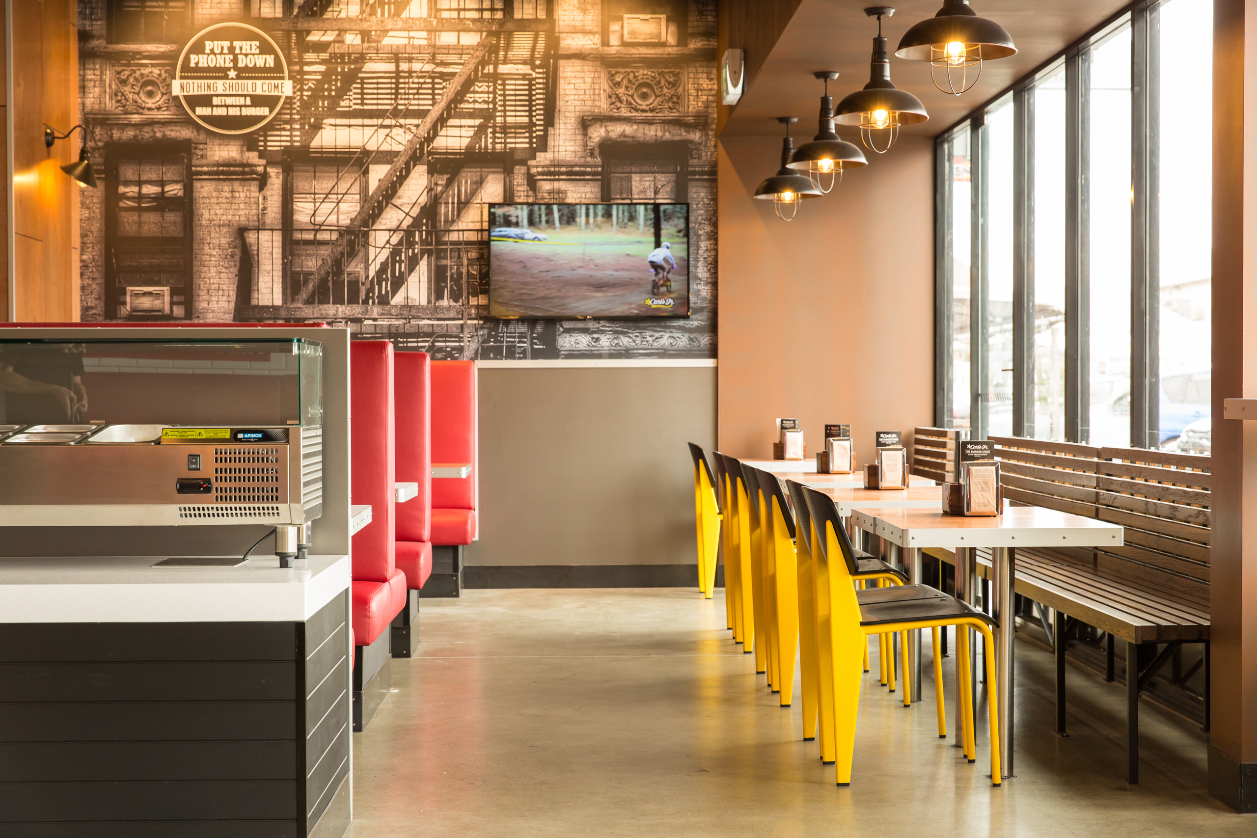
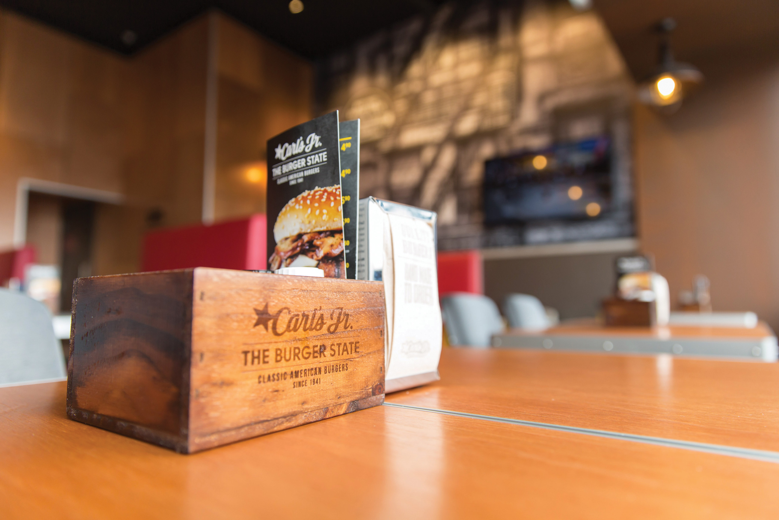
We ploughed through the brand research, visited burger bars, soaked up and documented our experiences, and shared our expanding knowledge and waistlines with interior designers. Carl’s Jr.’s 70 years of brand equity led us to redefine the in-store customer experience and tie it to a story of an American classic.
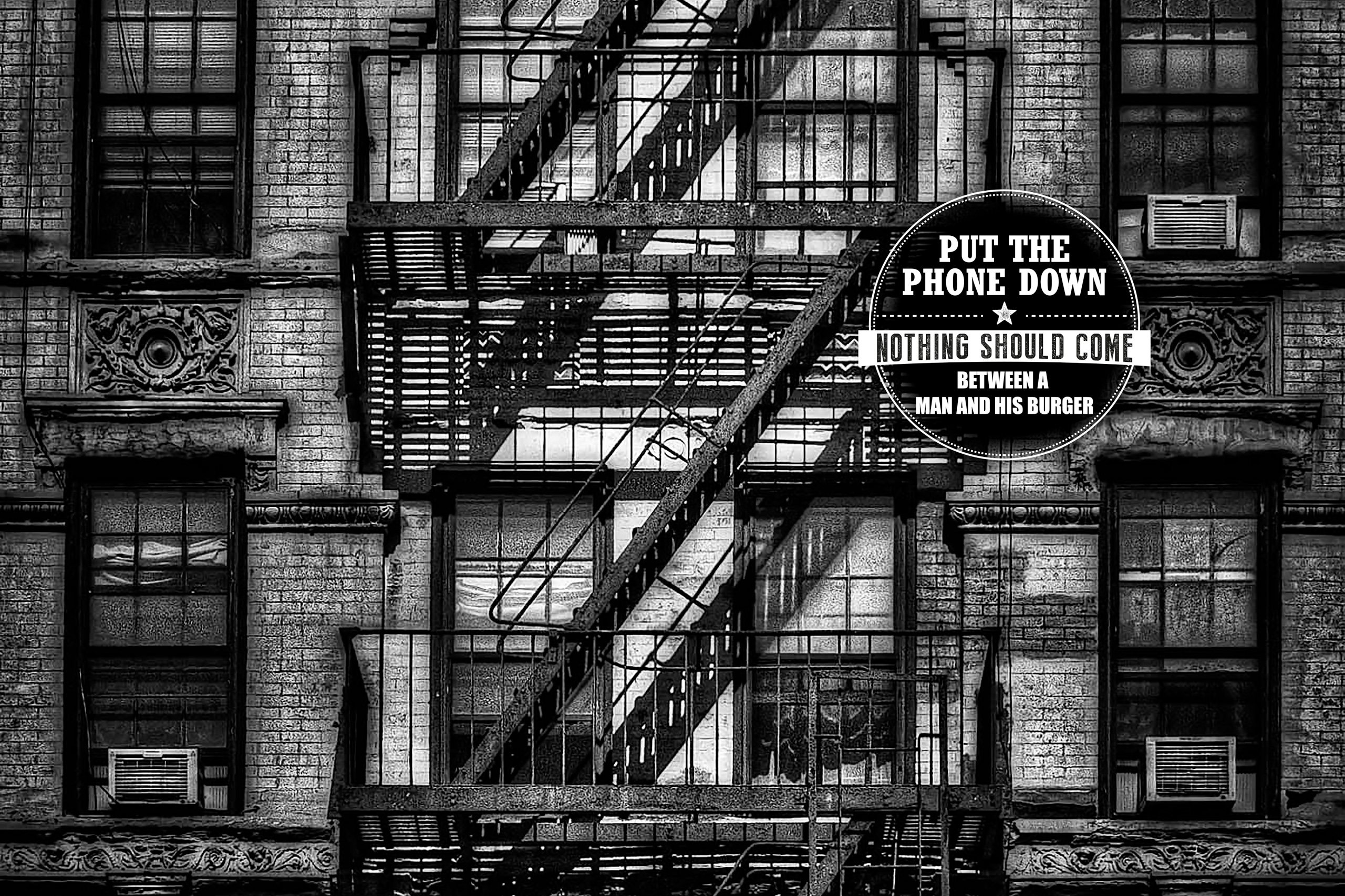
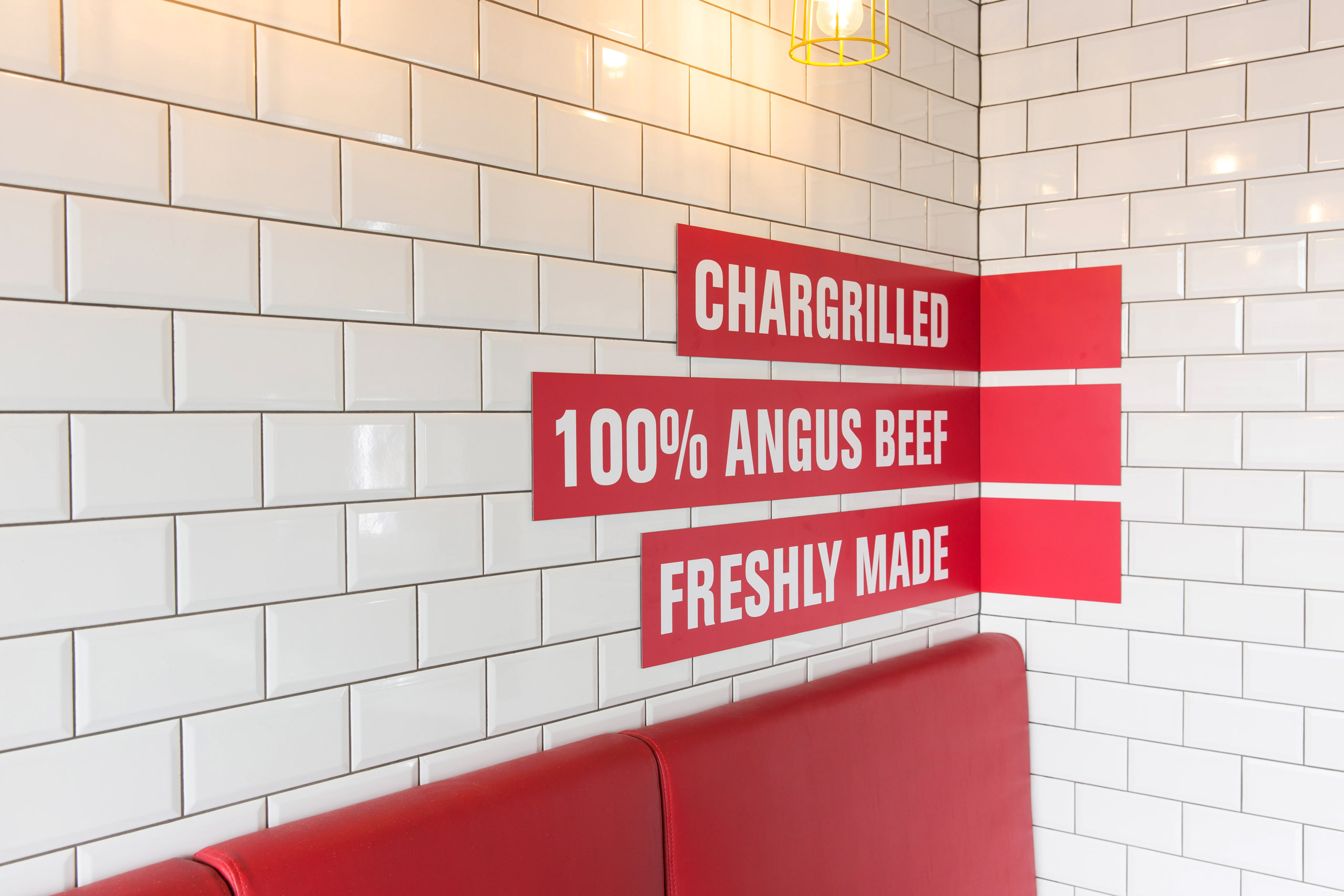
The result is a refined and altogether slicker logo plus brand language, ambient graphics, and packaging, and all combining with textures and substrates to deliver a new Carl’s Jr. They don’t make burgers like they used to. But we do.
