Restaurant Brands
Restaurant Brands
Values and behaviours – depends on where you’re standing
A change of office for Restaurant Brands was the perfect opportunity to gee up the culture by injecting some of the company’s internal values and desired behaviours into the new space.
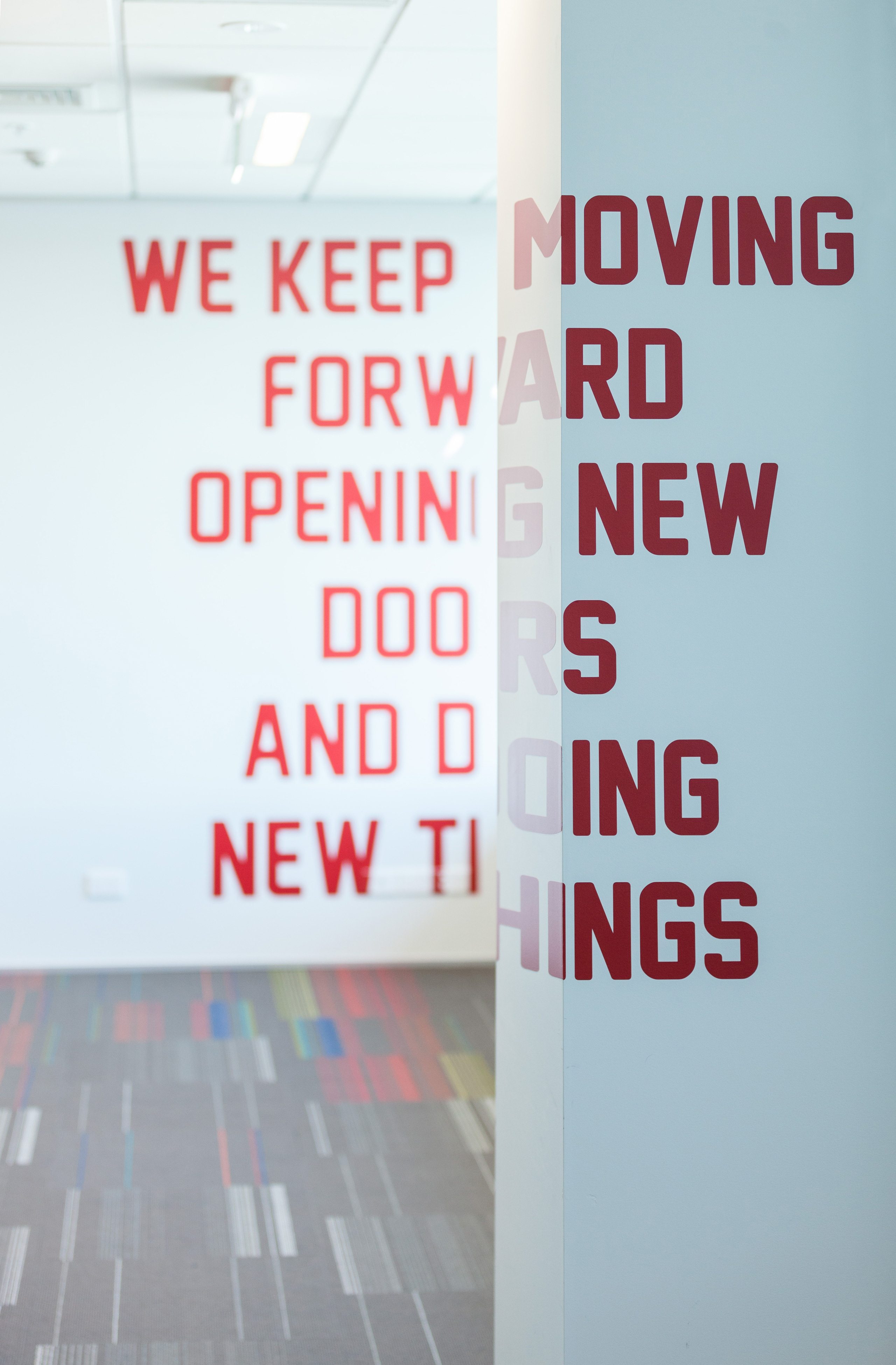
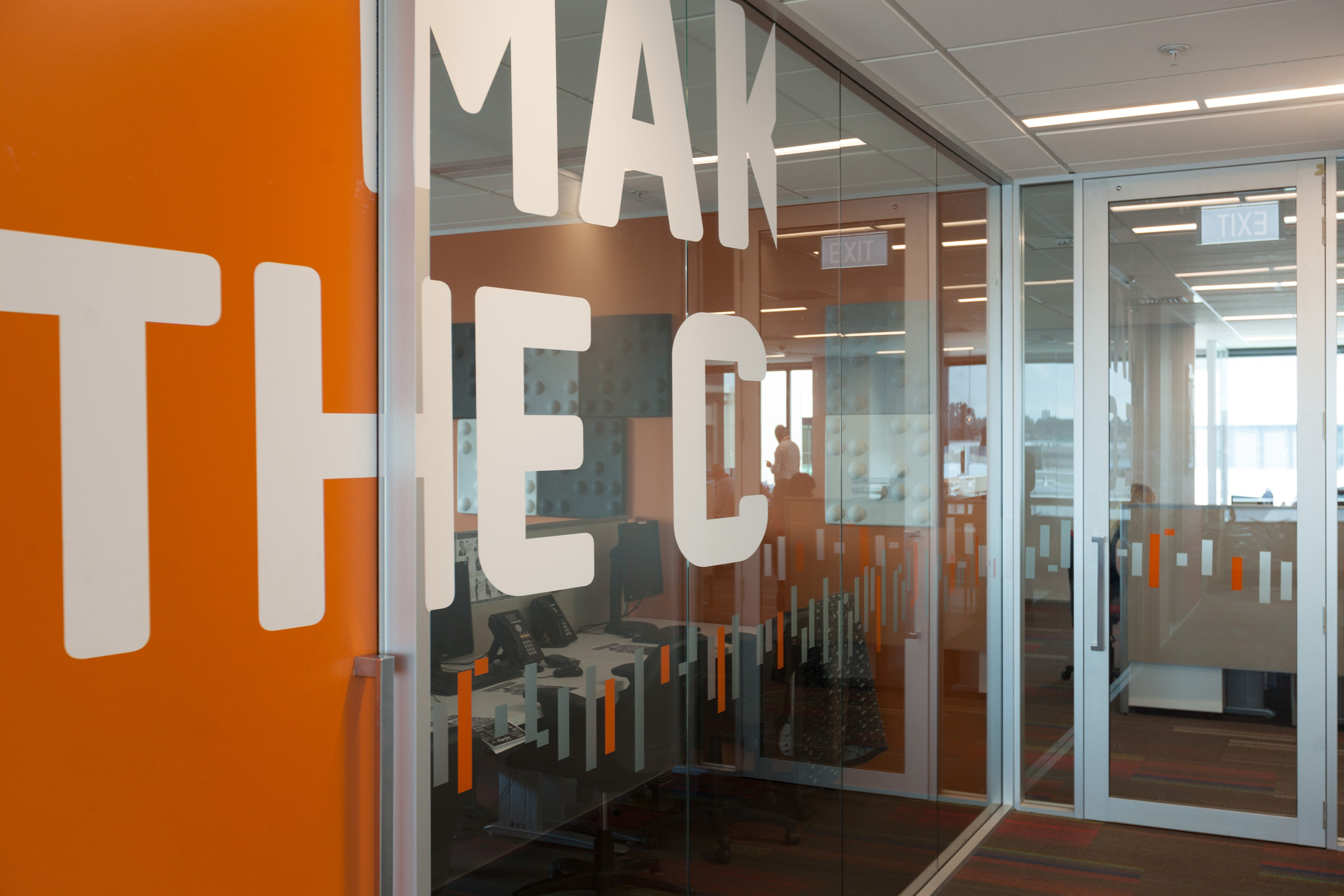
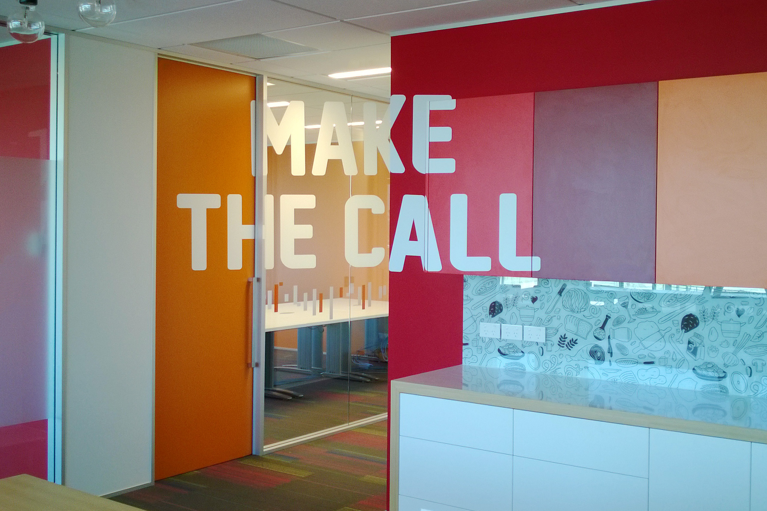
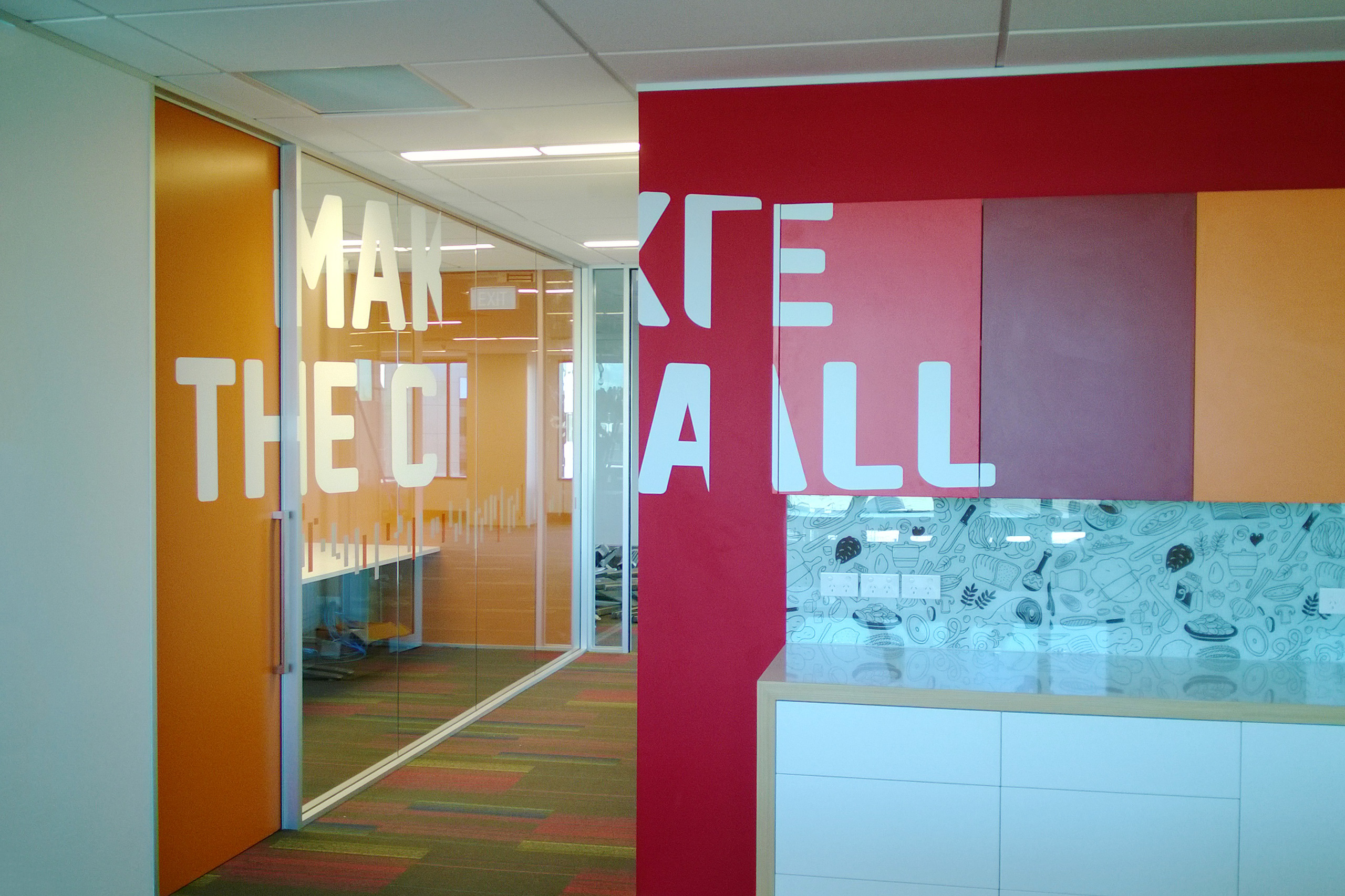
We wanted to develop an approach that deliberately steered clear of the consumer brands – KFC, Carl’s Jr., Pizza Hut and Starbucks, each with strong identities of their own – and instead provoked thought and action on a daily basis without becoming corporately predictable and boring.
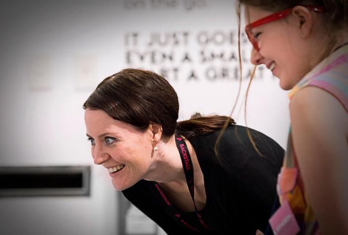
Type was our answer. Not nagging statements that would eventually disappear into a wall and never be noticed again but quirky, arresting and dynamic arrangements of type and language that compelled staff to literally align with company values. Visitors to Restaurant Brands enjoy the discovery, and the company’s staff are proud of the extra dimension and talking point that creativity and design has brought to their workspace.
