Neurological Foundation
Neurological Foundation
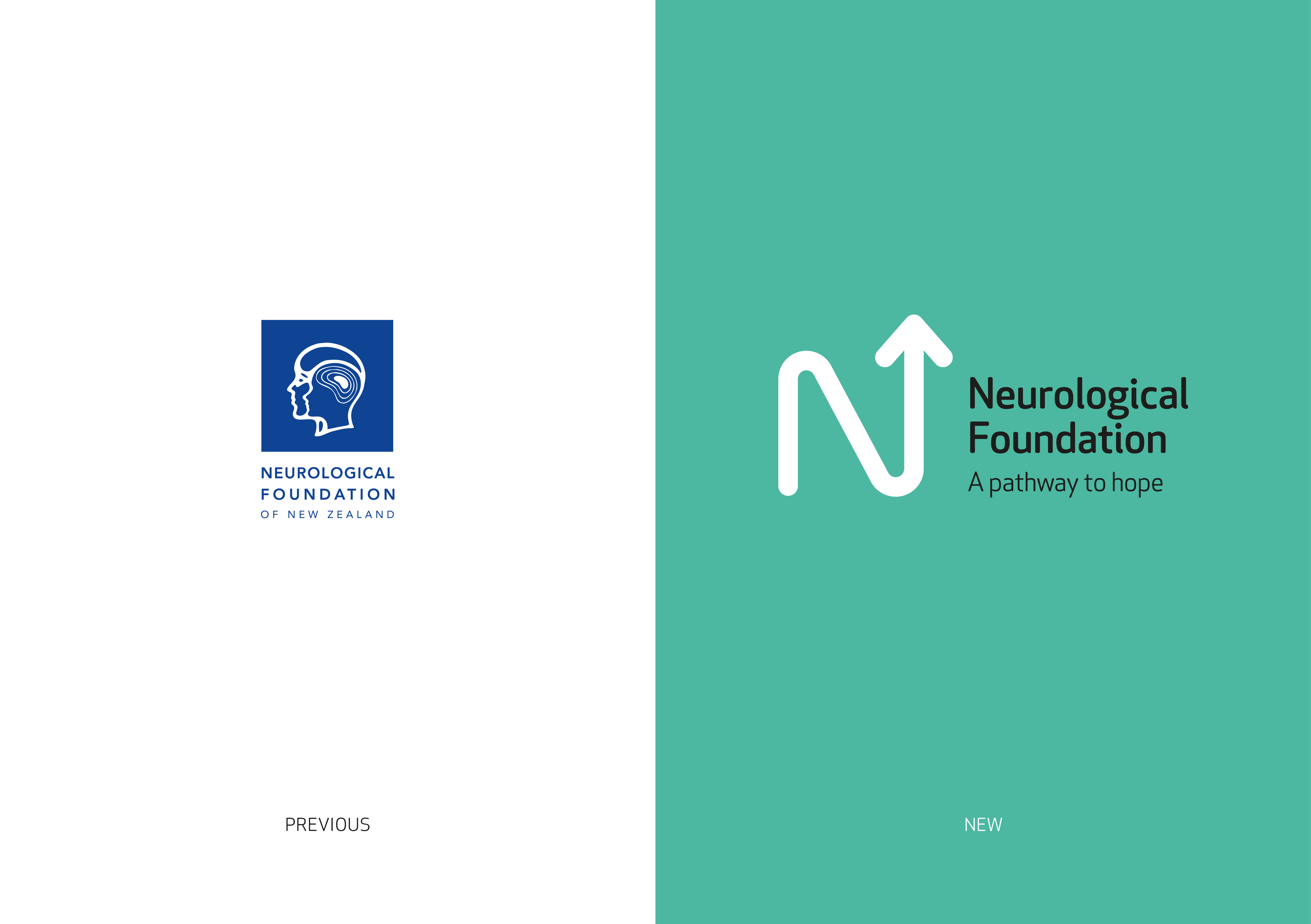
Brand Identity
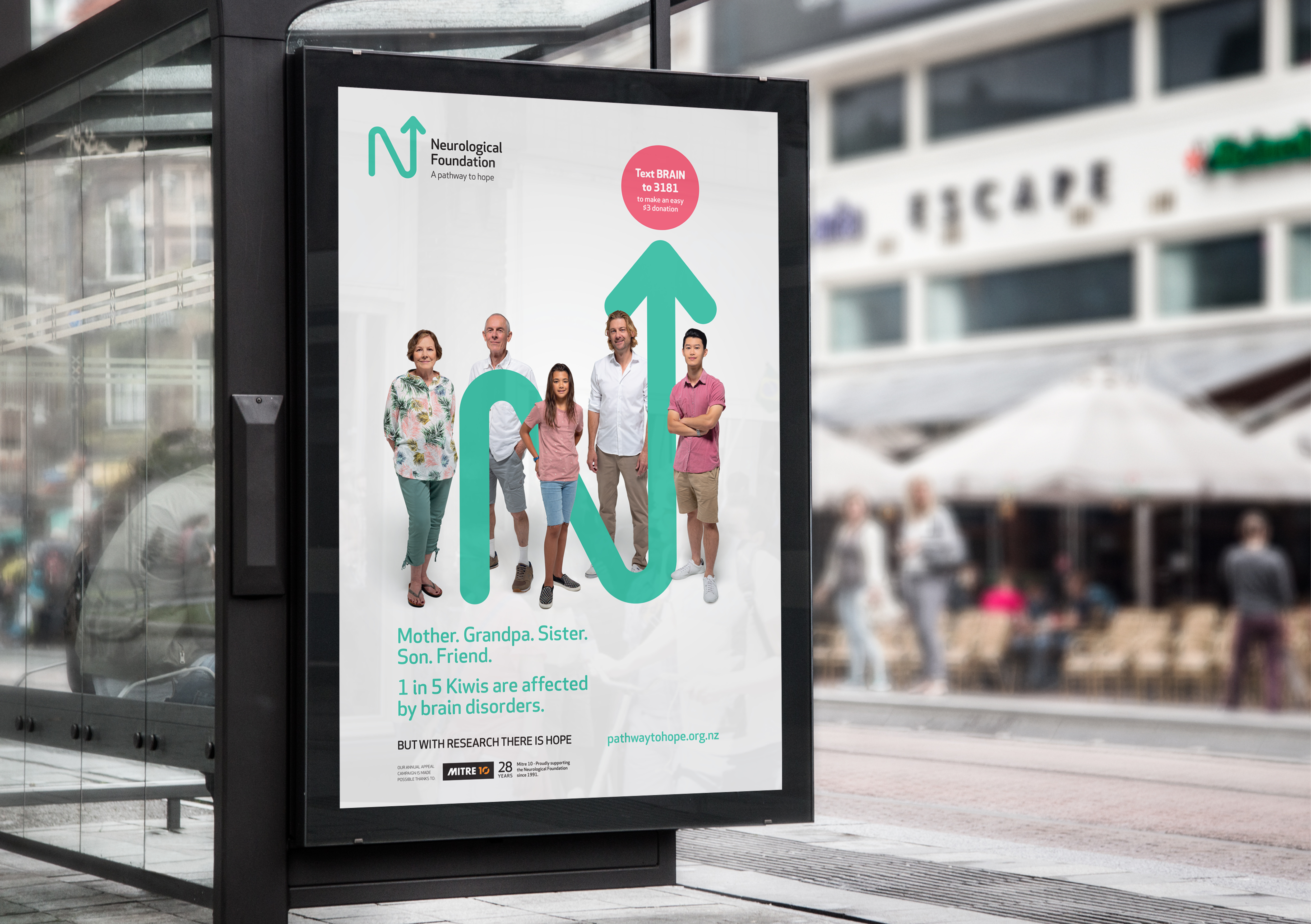
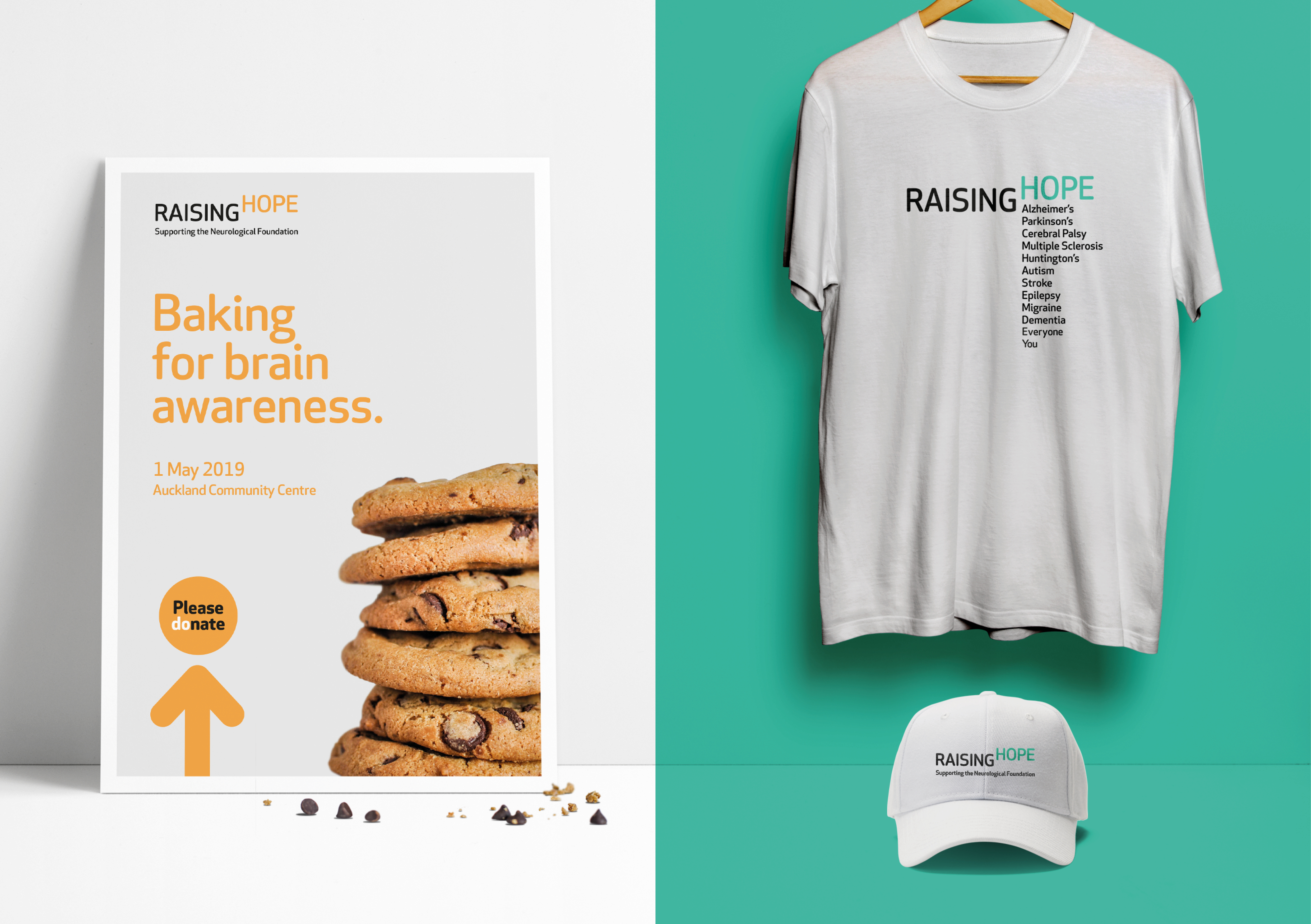
Raising hope
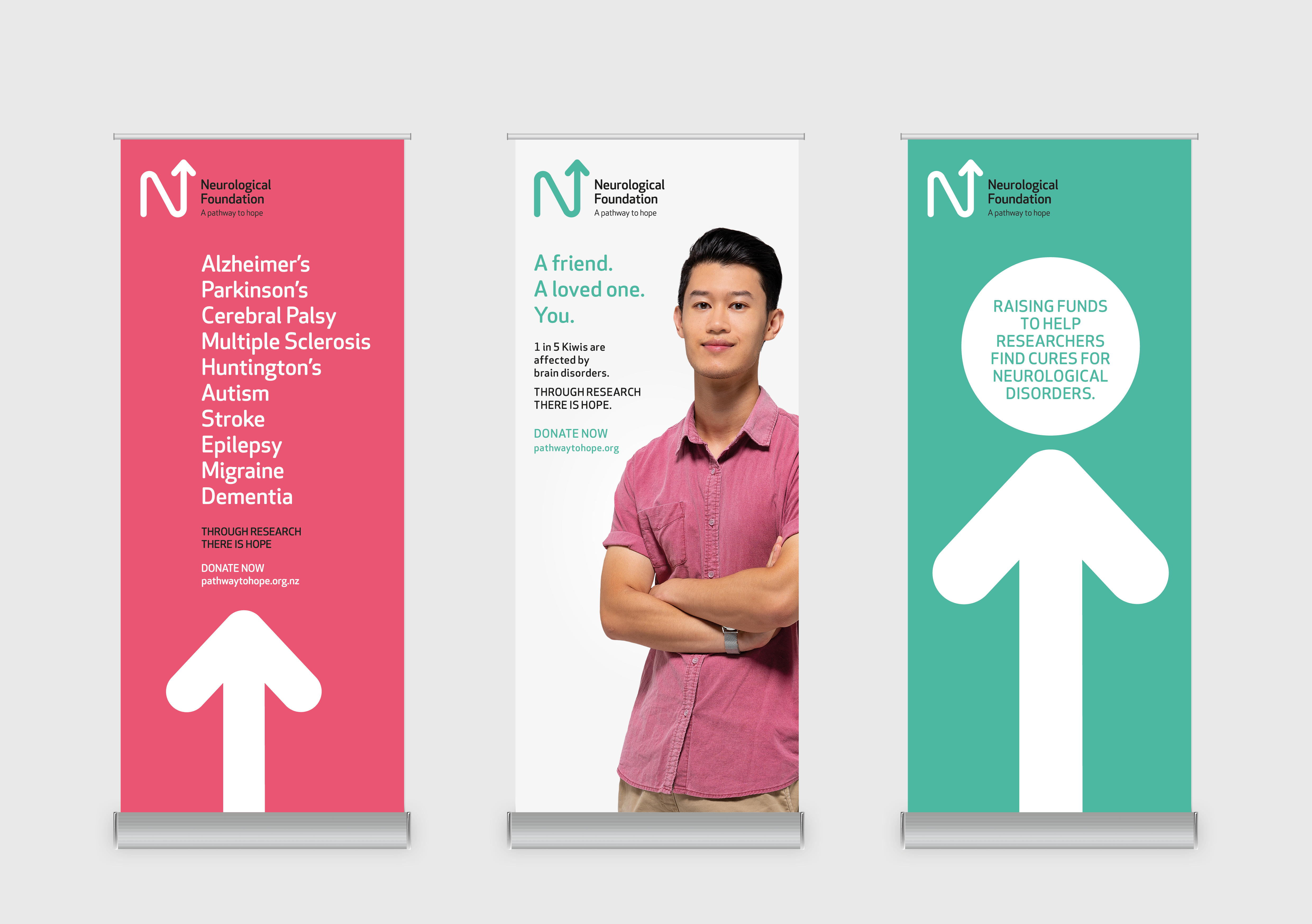
With a traditional (and declining) donor base of 70-80 year olds, the Neurological Foundation recognised it needed to attract a younger donor profile to sustain the flow of funds for research into diseases of the brain and nervous system: think Alzheimer’s, Parkinson’s, Huntingdon’s, stroke, epilepsy.
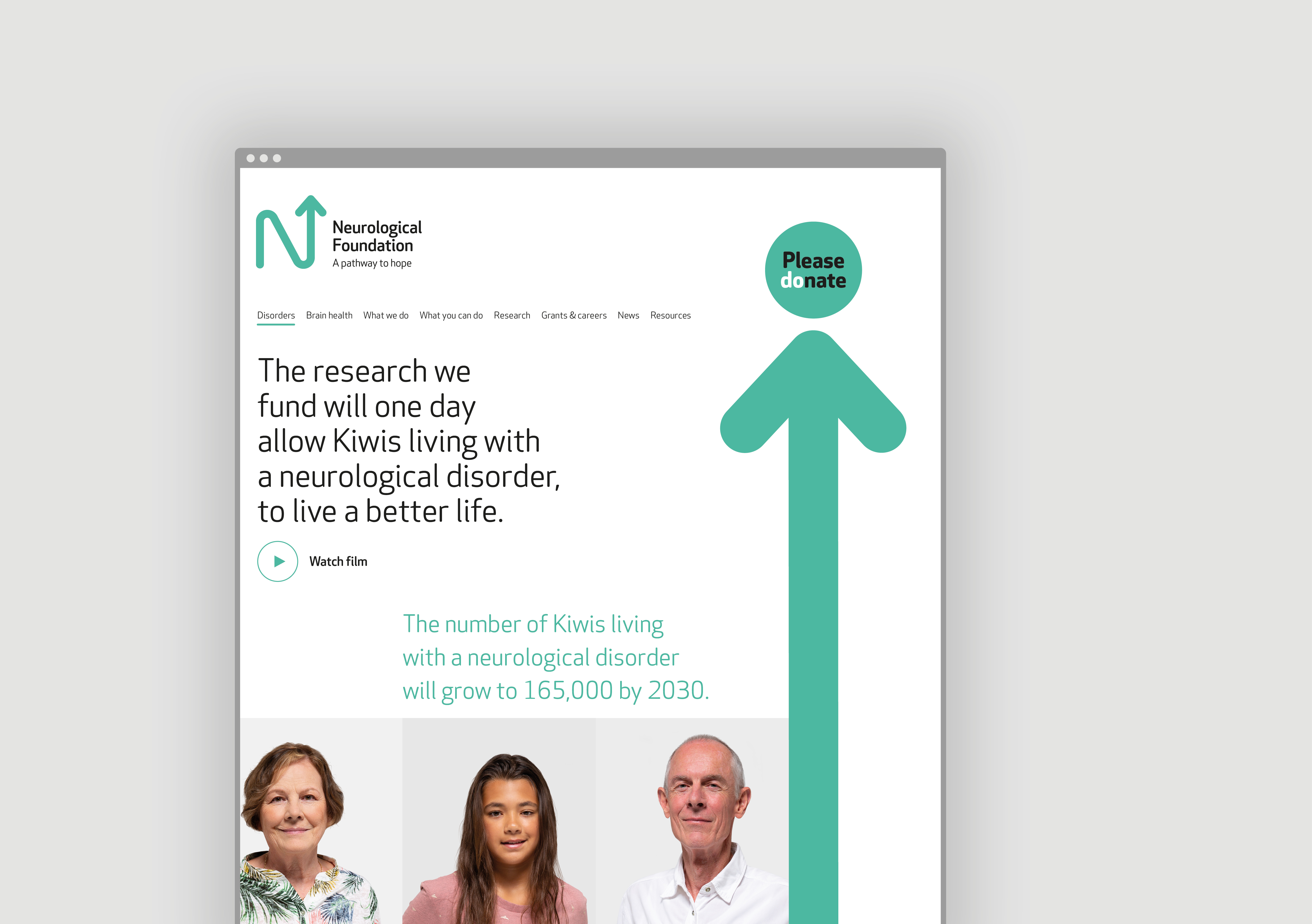
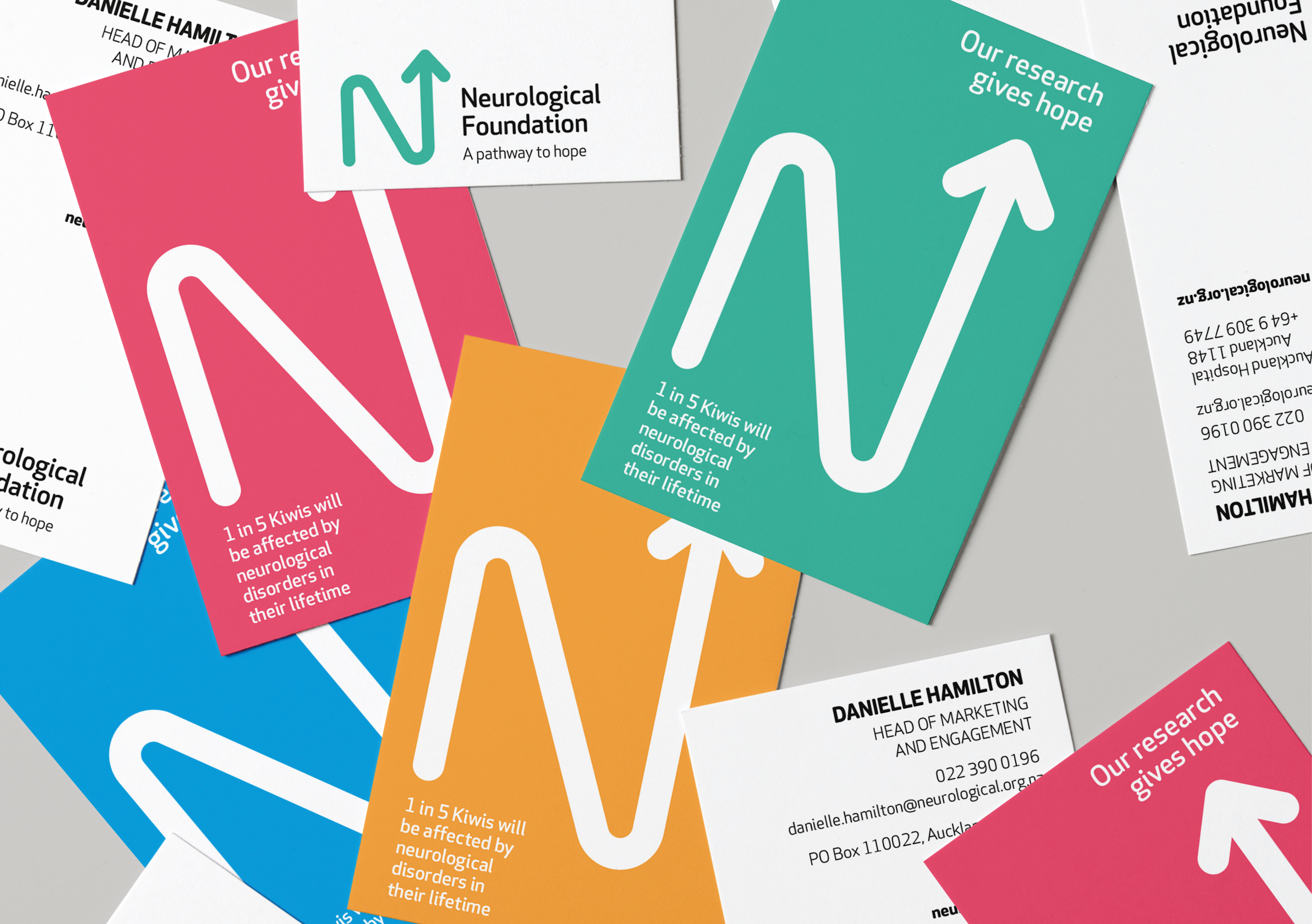
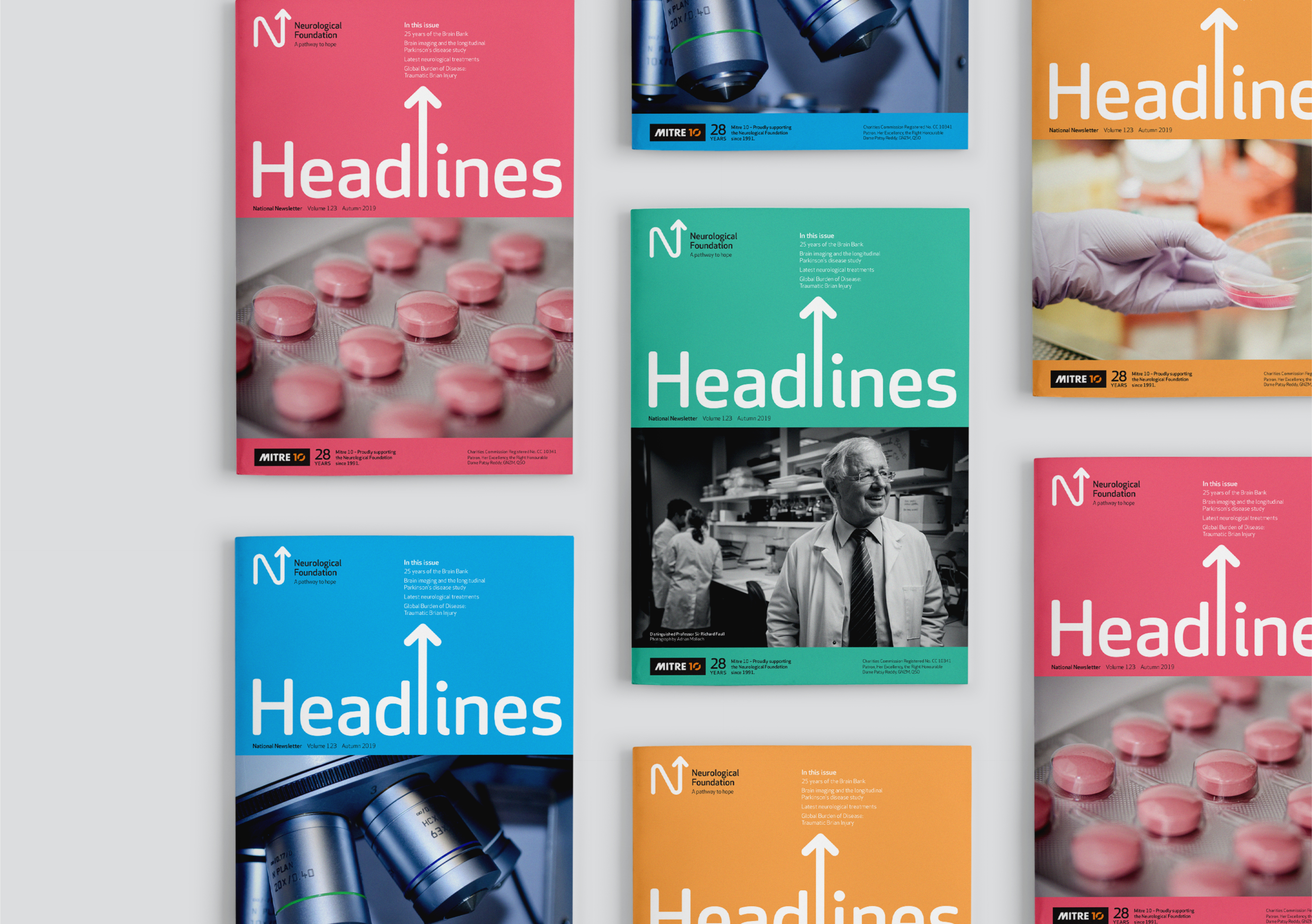
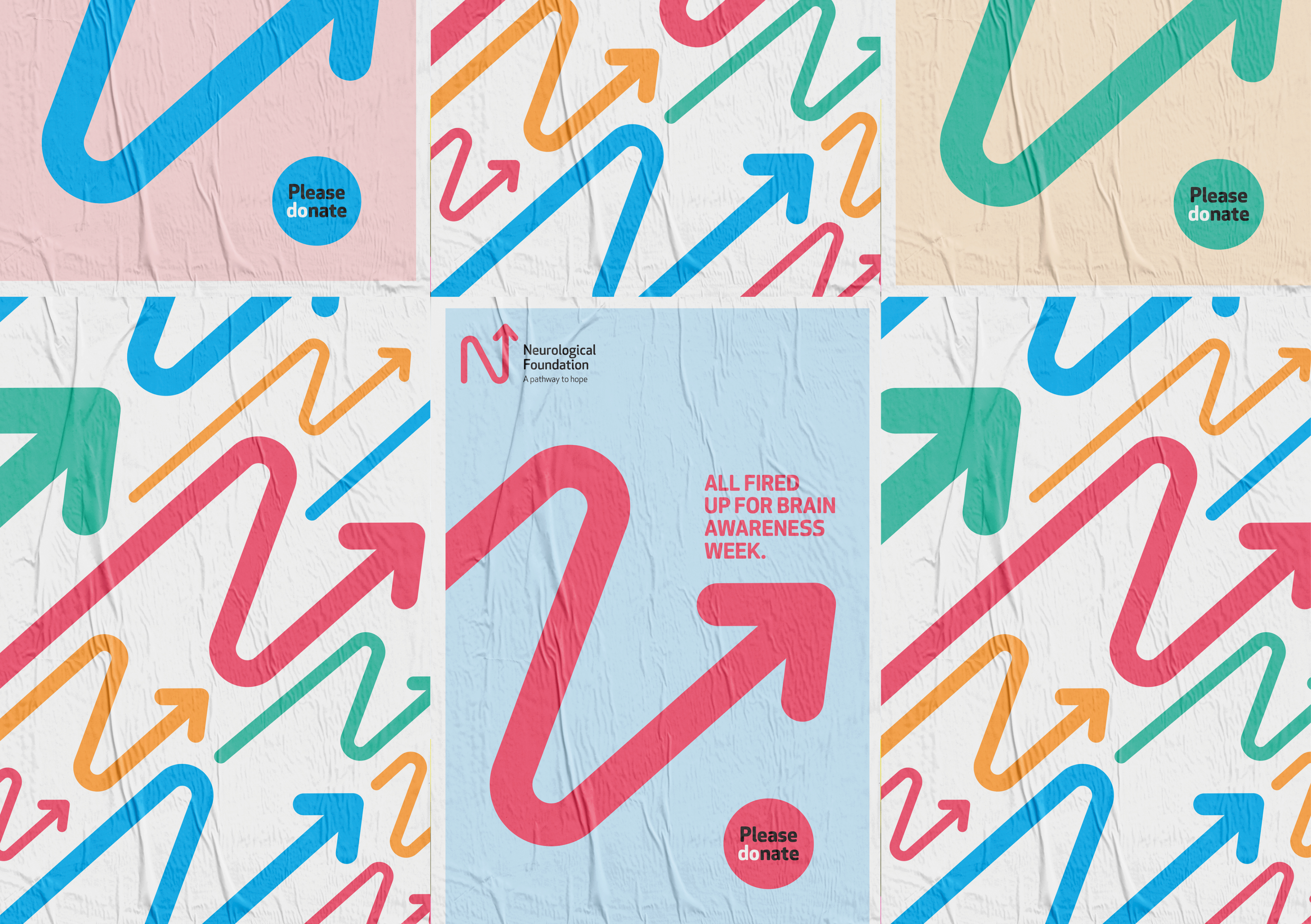
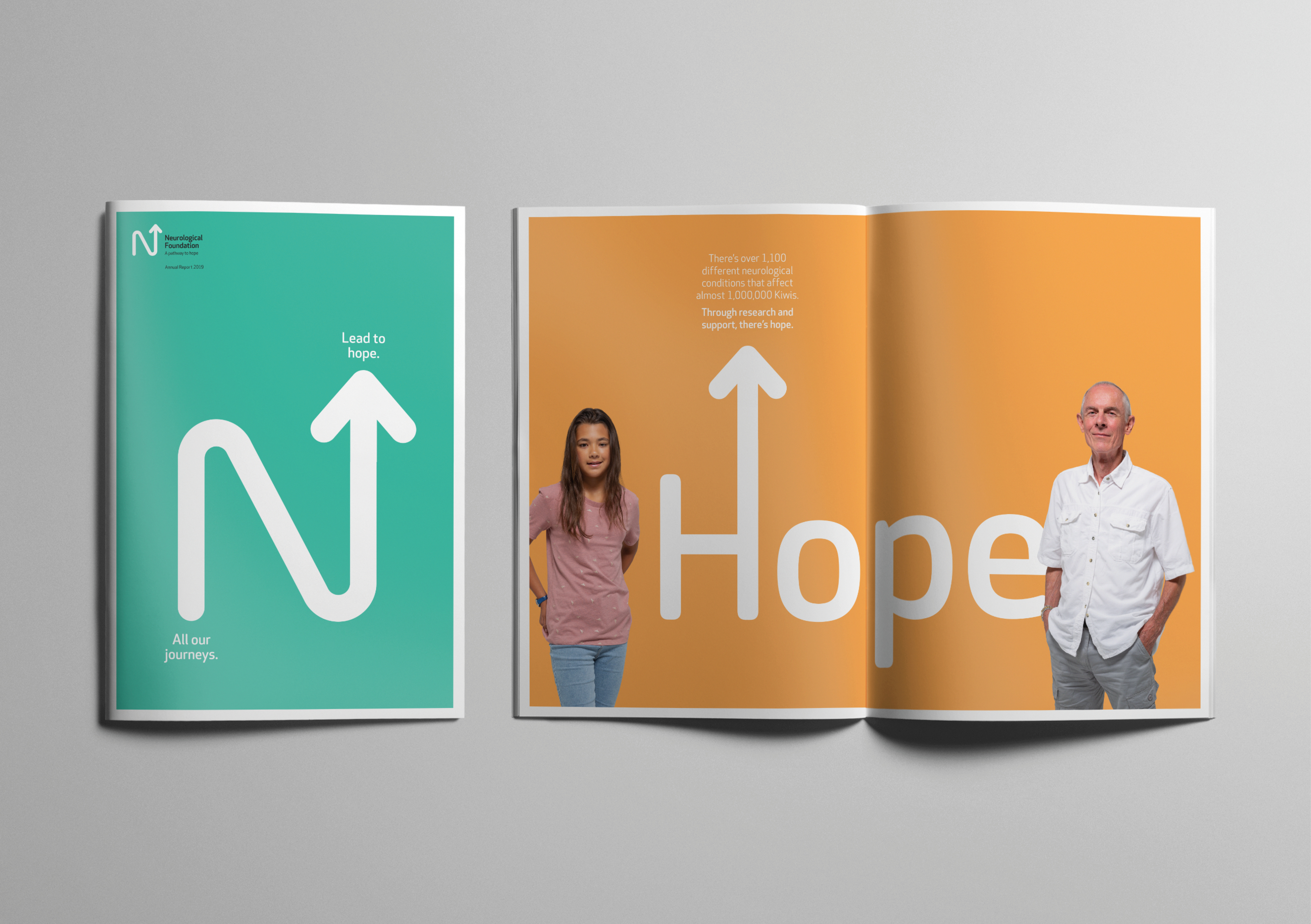
The previous stale, one-dimensional, white-coated visual identity had to go. In its place, and to reflect a more contemporary and fresher appeal, Saturday’s drew upon the ‘N’ as a point of origin and a mark that leads us on a path of discovery, albeit not a straightforward one – but a positive journey that ends with hope. This mark is at the heart of the visual identity and inspires all communications.