PaintPlus
PaintPlus
Brand identity reno
PaintPlus is a brand well-known to professional decorators and film scene artists — a Kiwi-owned product renowned for its quality. We were given the opportunity to reframe the story for a broader audience, from interior designers to everyday DIYers.
First up, we had to address the obvious question: PaintPlus... what?
Turns out, quite a lot.
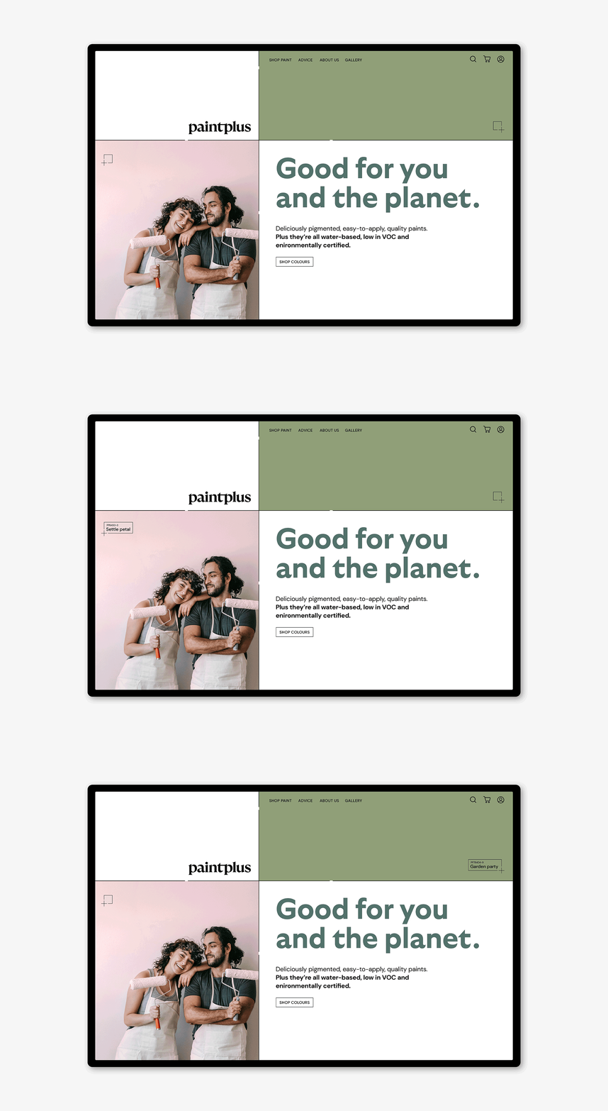
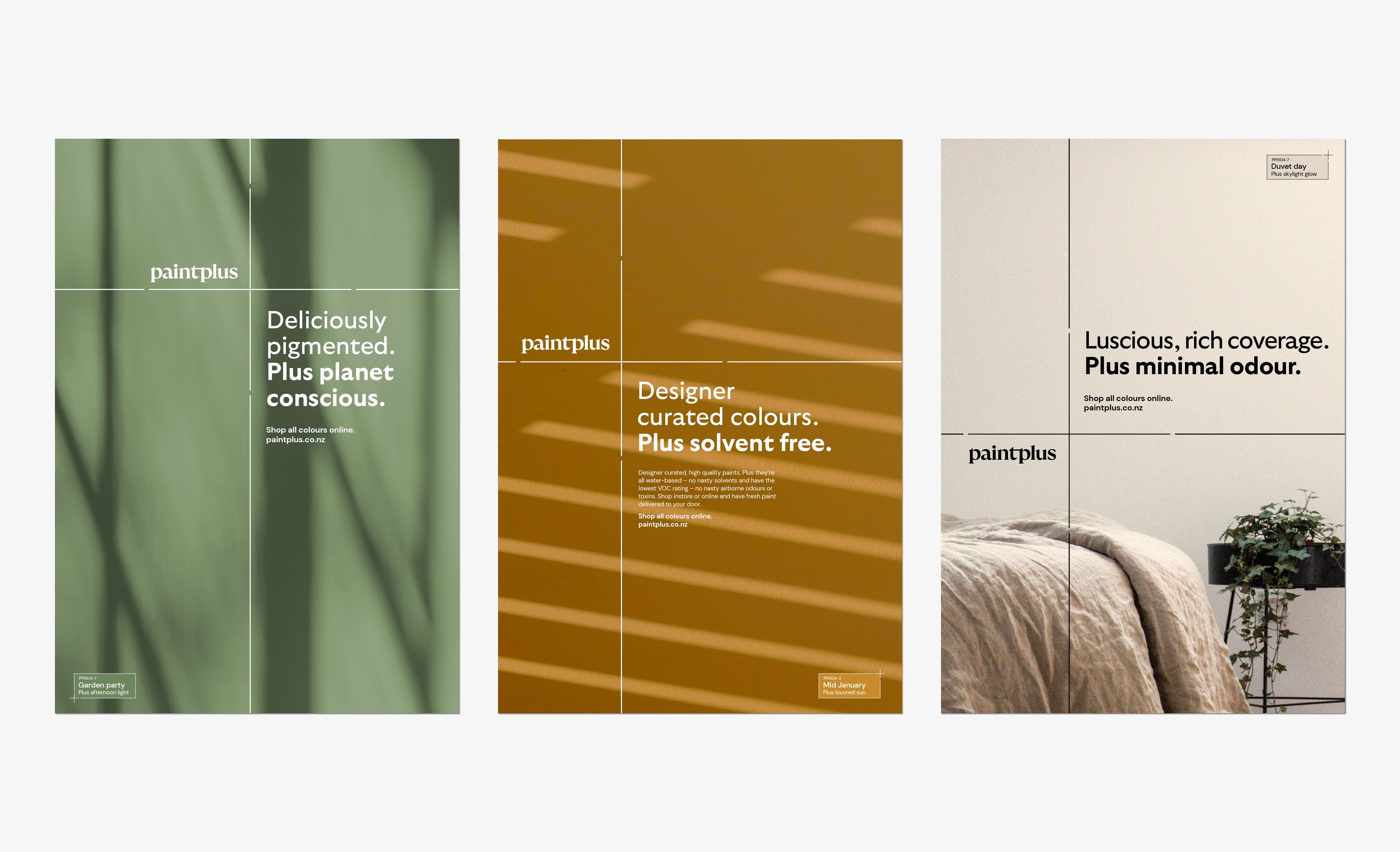
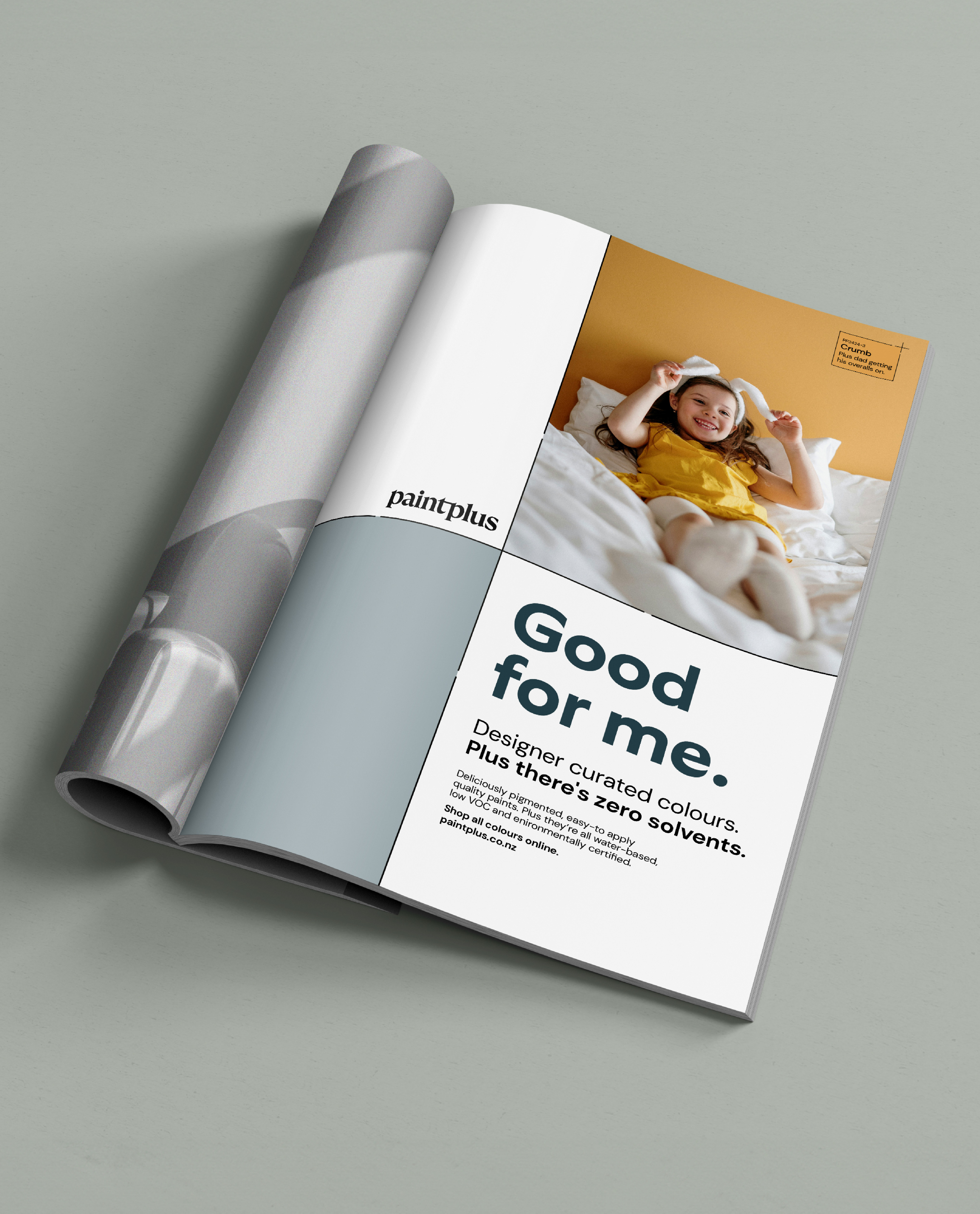
This is paint plus a conscience. Carbon positive, Toitū certified and solvent-free. We brought this core point of difference to the fore, with direct, engaging writing and imagery that’s both relatable and aspirational.
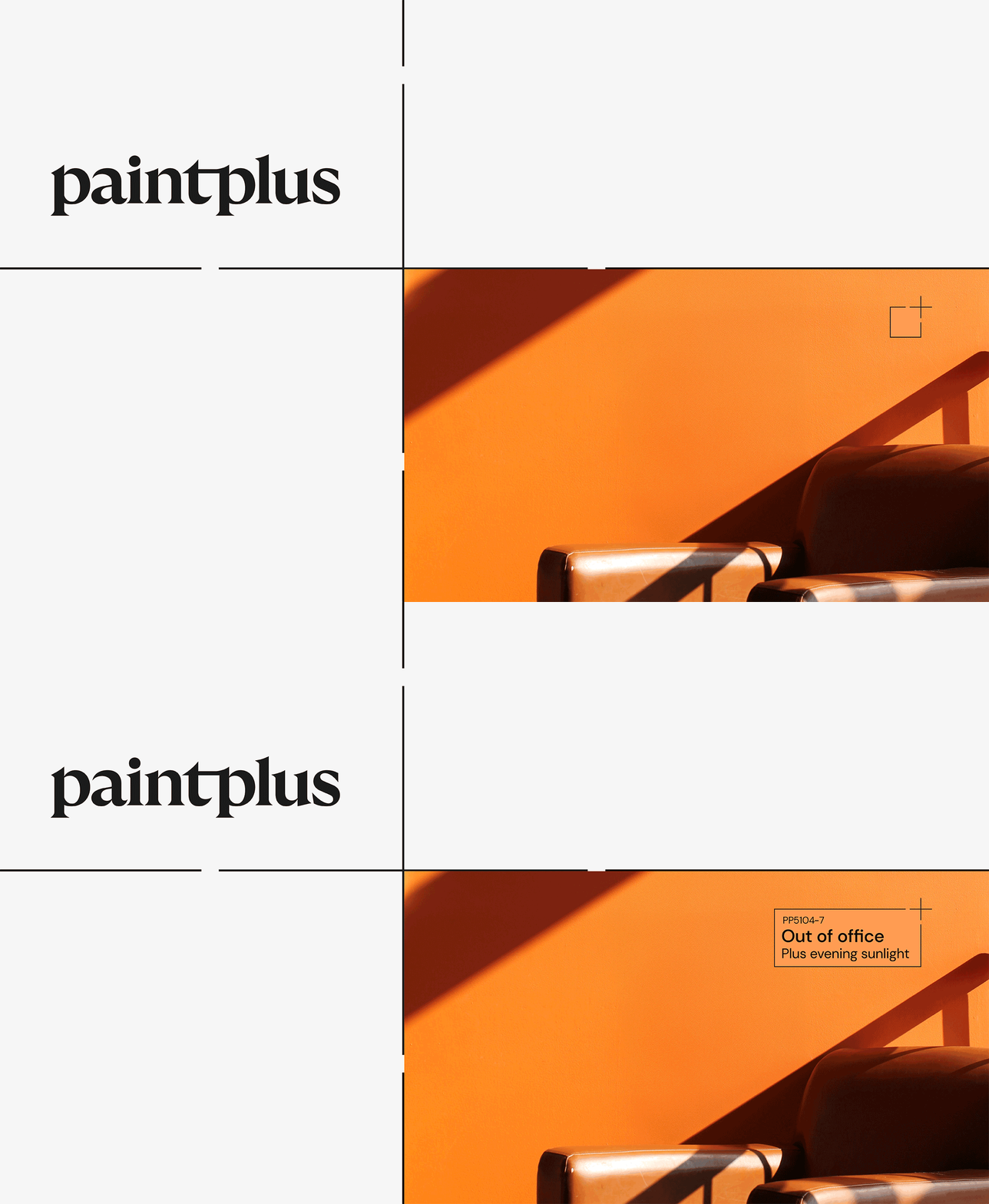
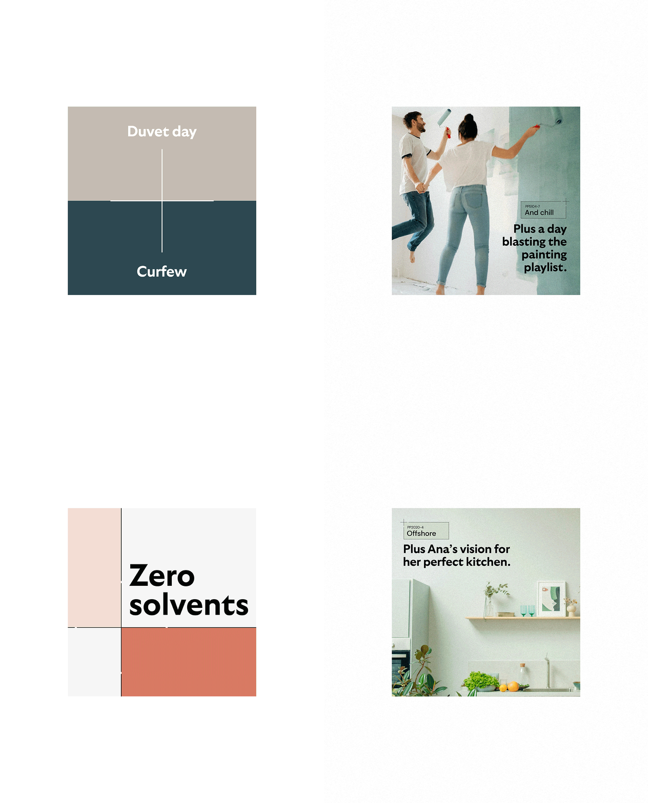
Then we extended the plus to mean even more. This is paint plus the effect of ambient light and shade. It’s one colour plus another to perfectly complement or contrast. It’s paint plus the joy, effort and inspiration put into choosing and applying it.
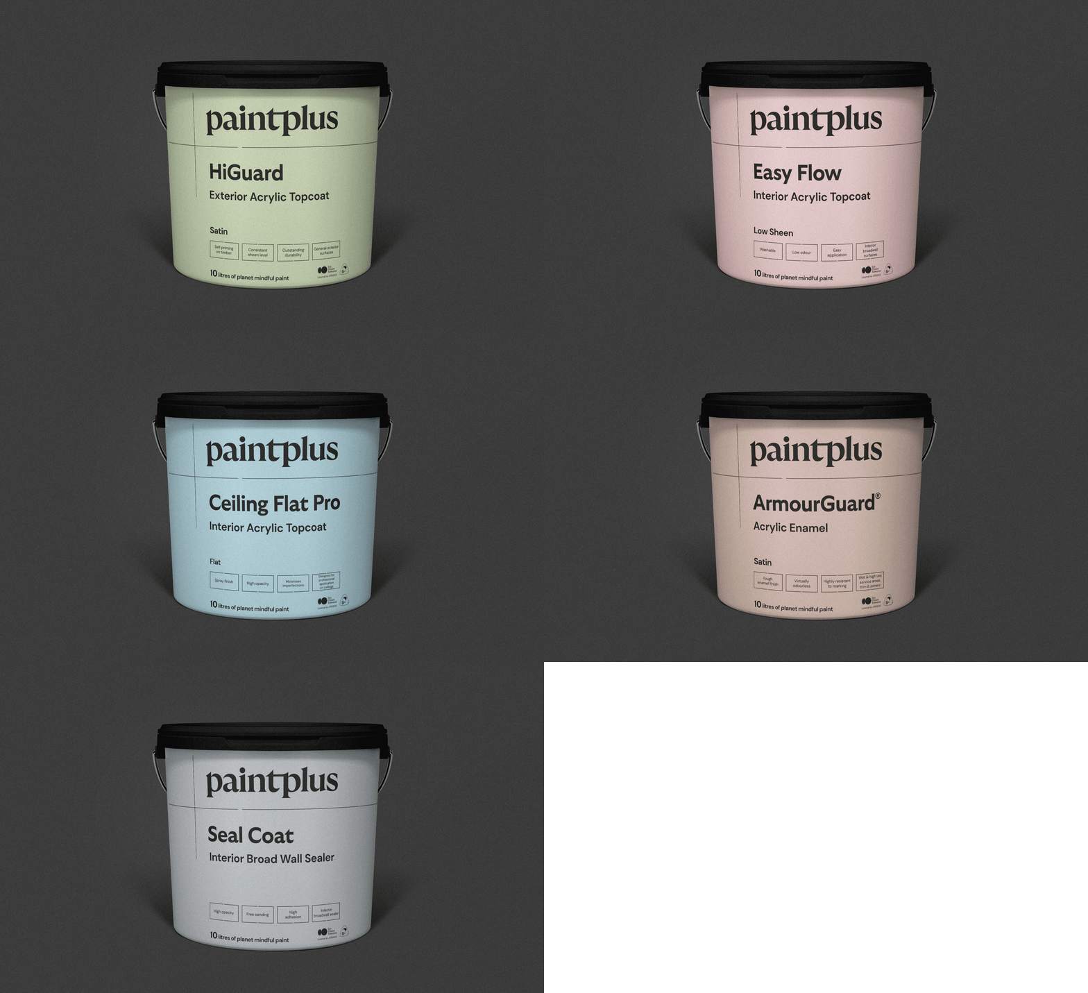
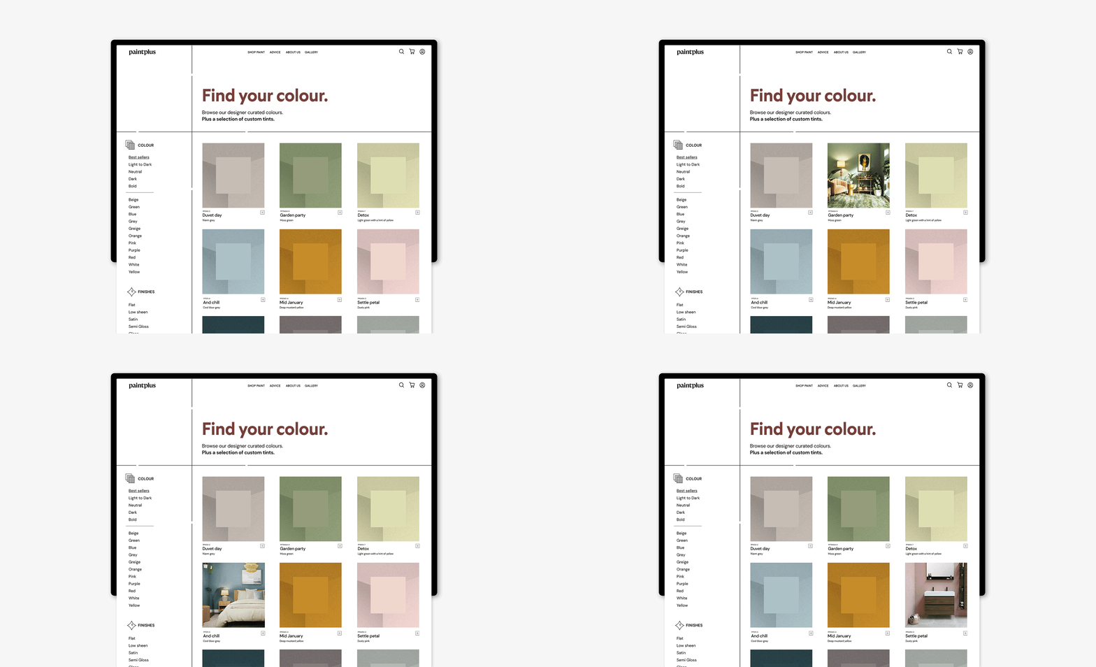
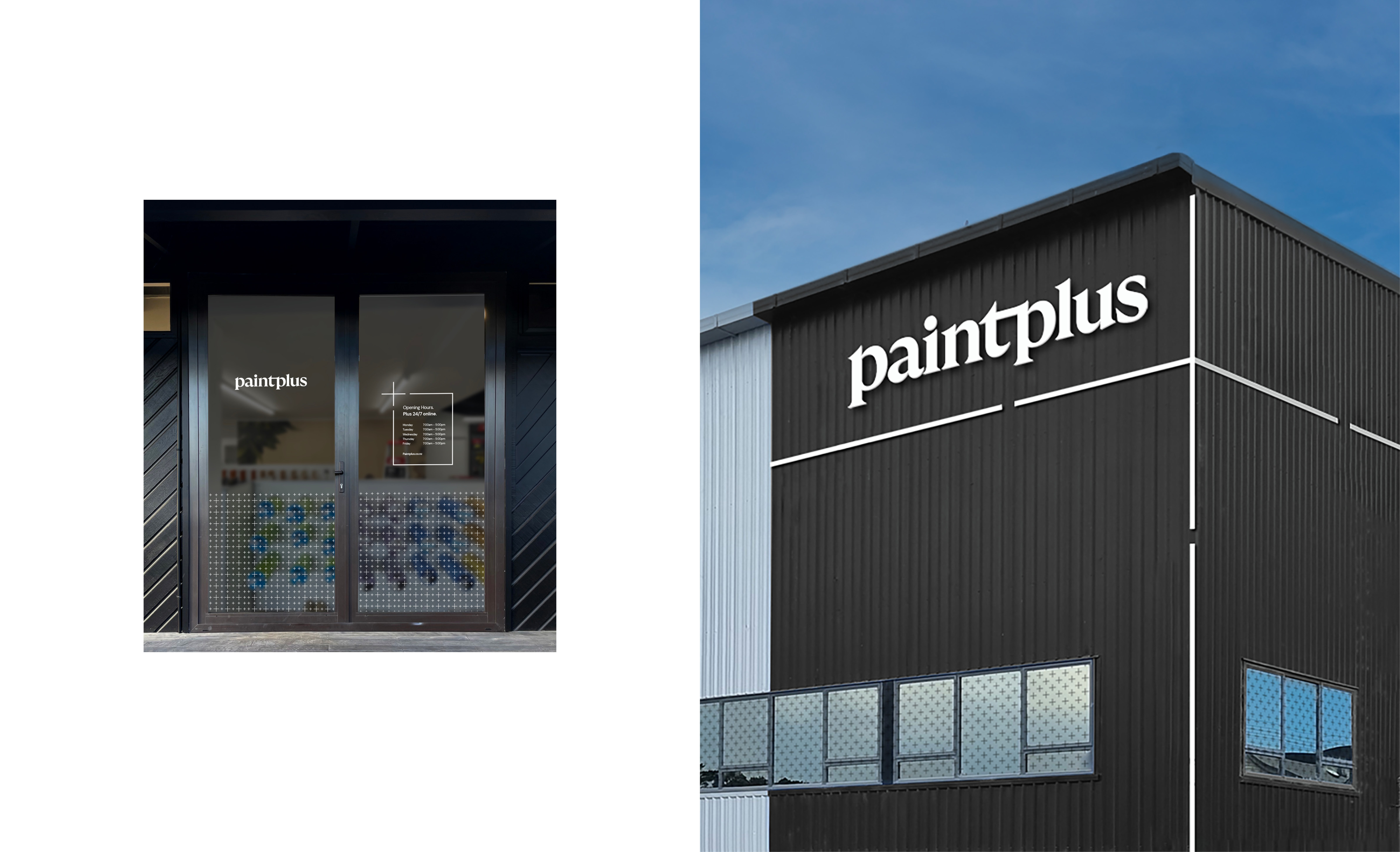
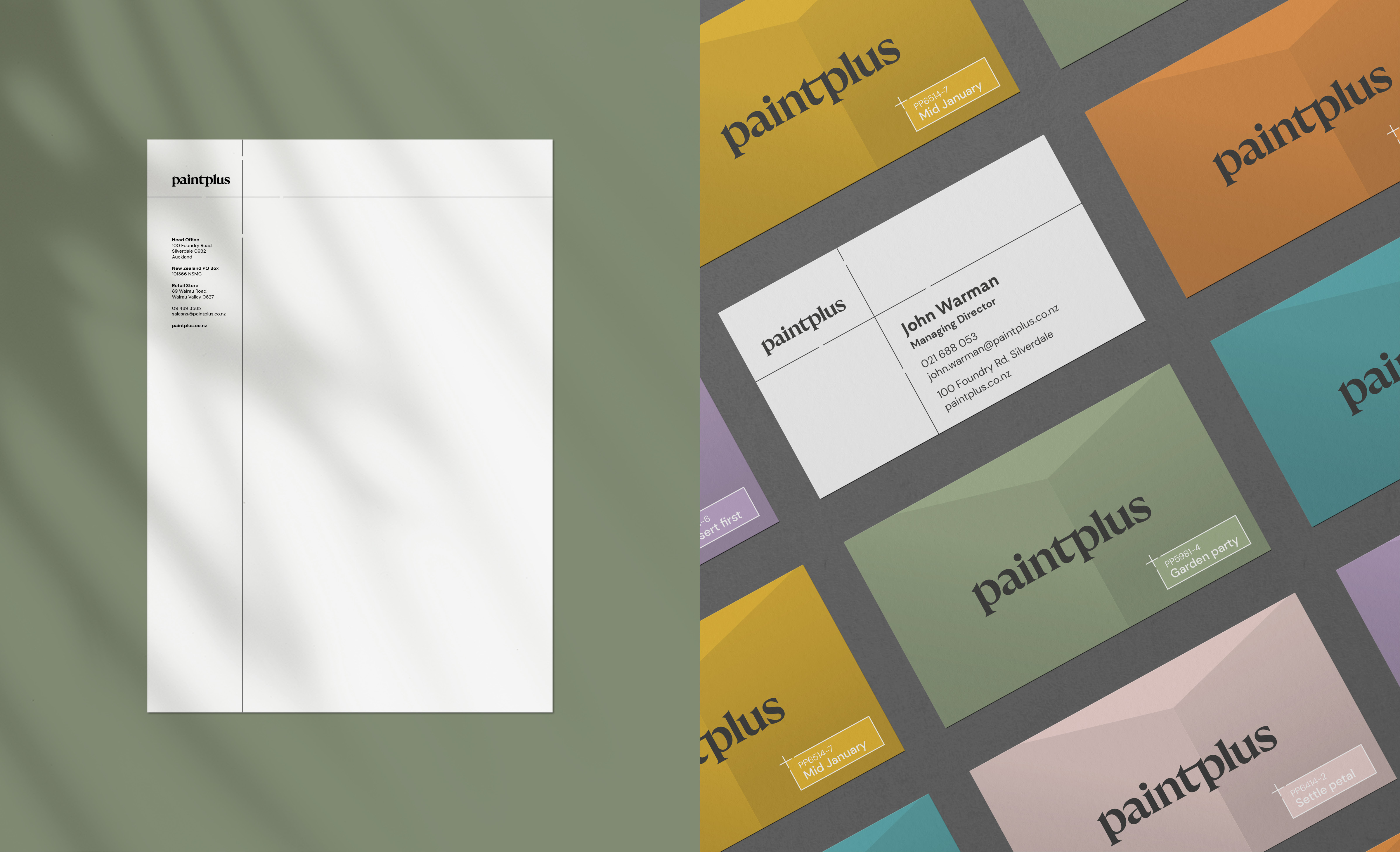
As a visual element, we flexed the plus to give it multiple functions, from a framing device to a colour identifier and shading texture. Led by a wordmark that draws from the satisfying lick of a brush, our brand elements turn up in crisp black and white, giving space and prominence to the varied hues of the product.
The outcome is an innovative reno for a brand effecting positive change.
PaintPlus. Better paint, made better.
