Vetro Raccordi
Vetro Raccordi
Branding the invisible
When a product’s designed to be invisible, what should the brand look like?
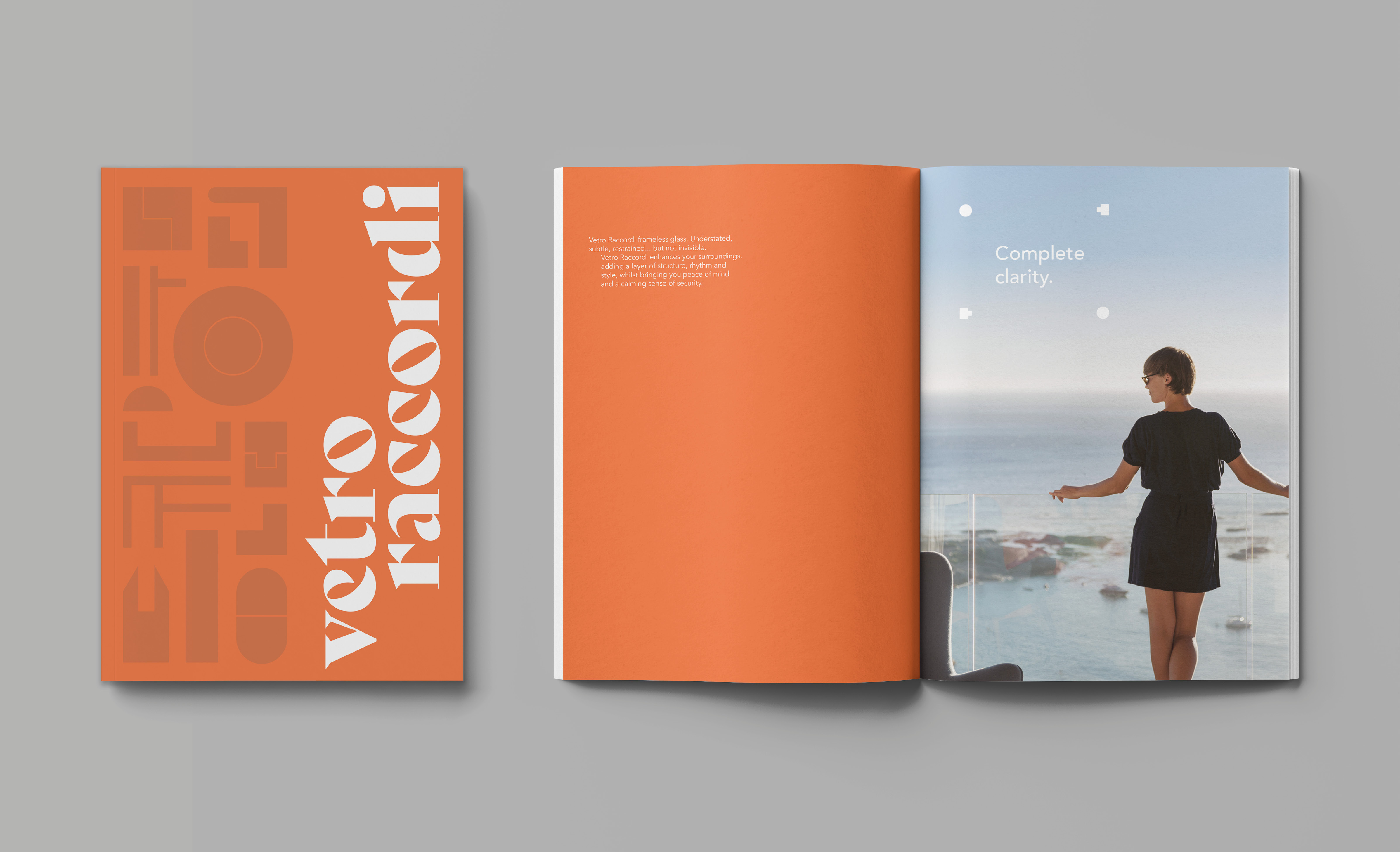
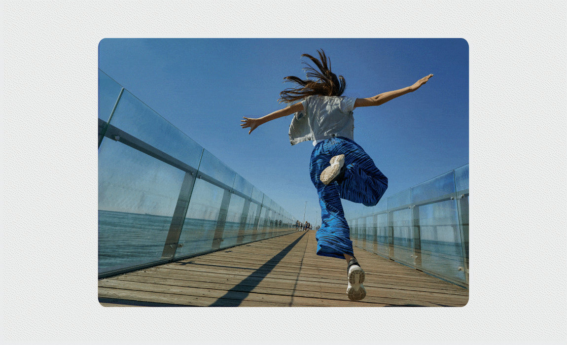
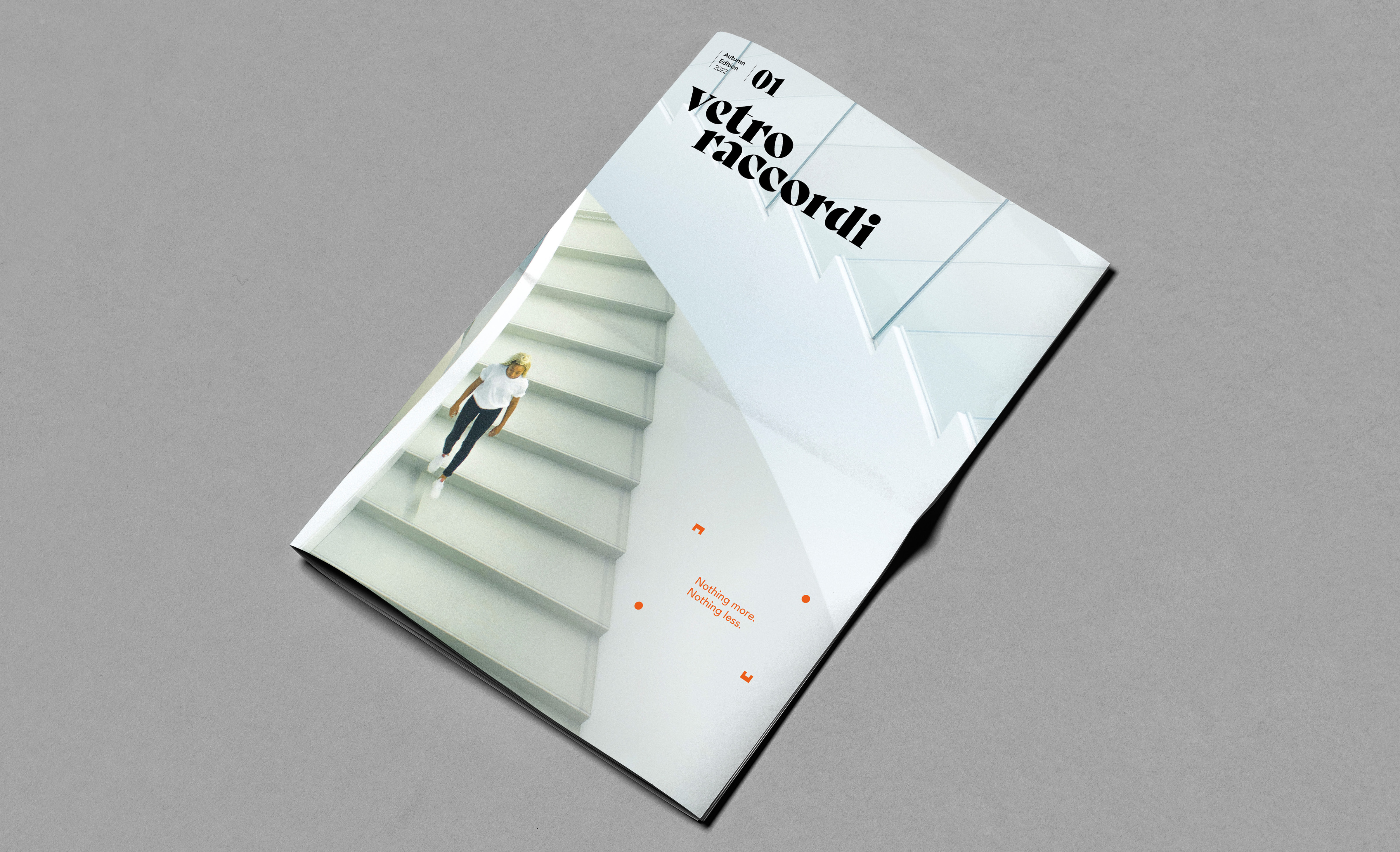
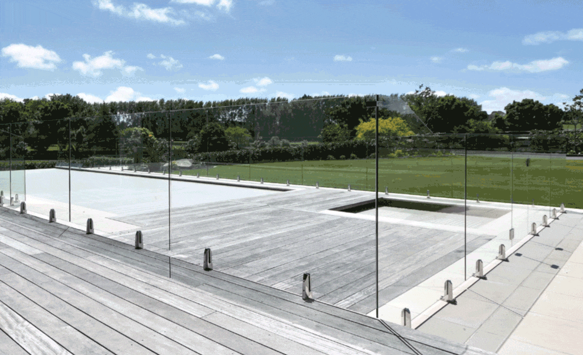
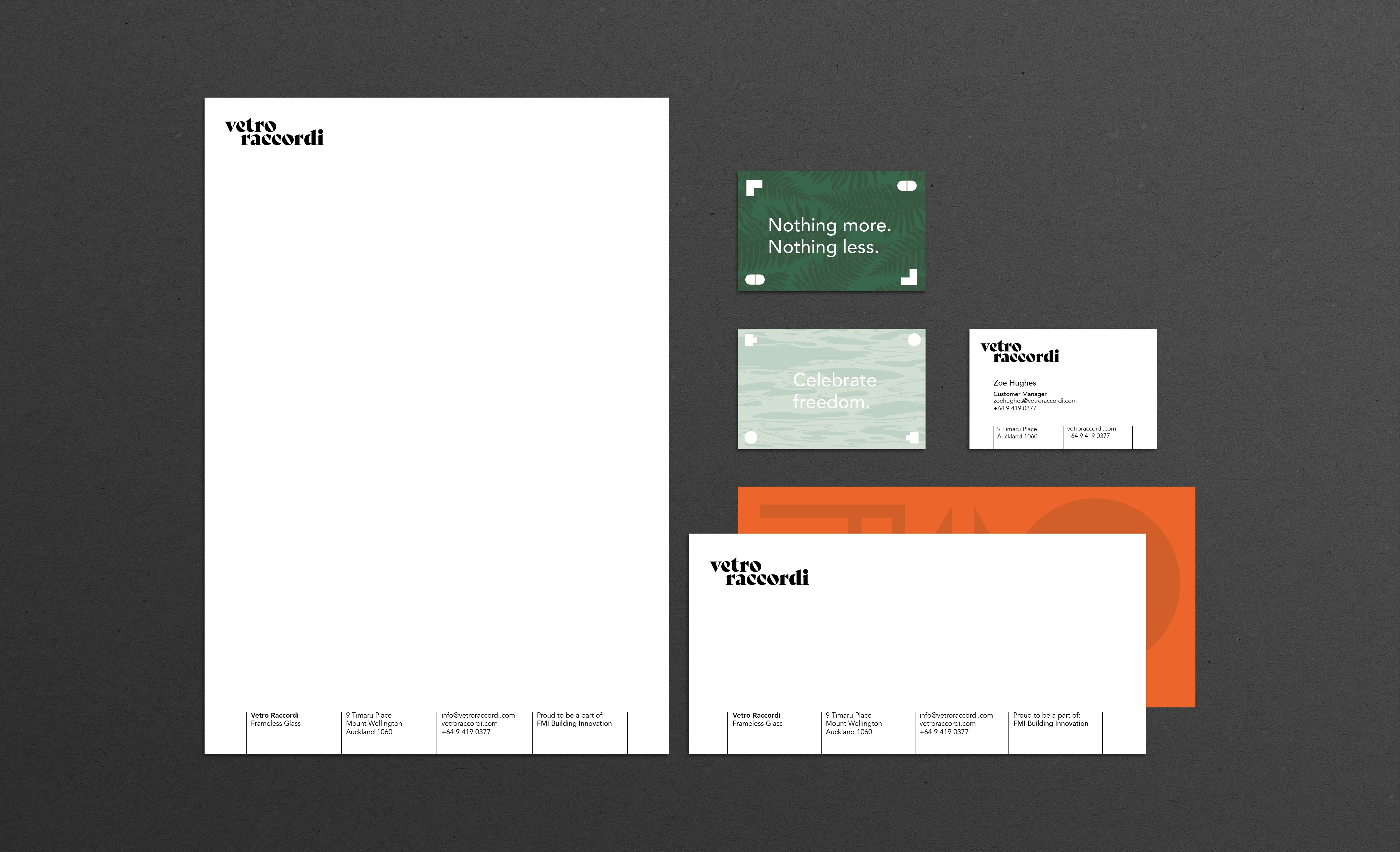
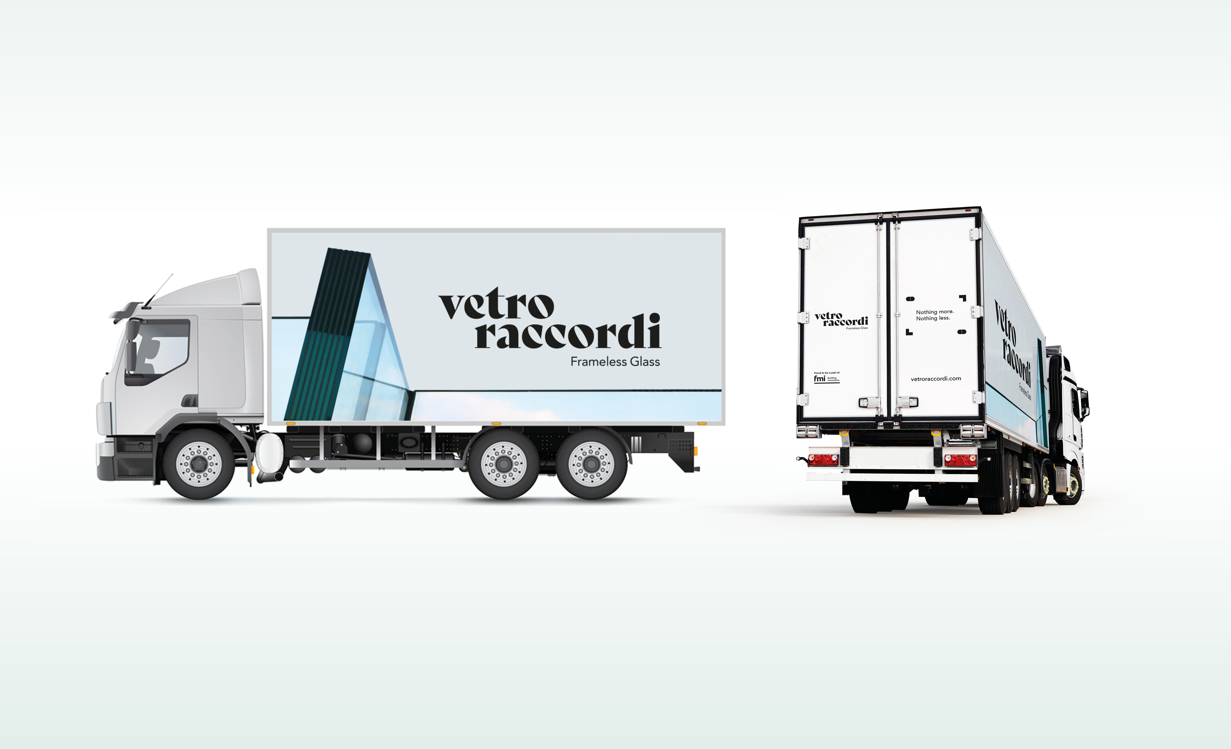
We decided to celebrate what is visible. Vetro Raccordi Frameless Glass need not apologise for its existence. It enhances its surroundings, adding a layer of structure, rhythm and finesse. The visible elements provided stimulus for a graphic language. Refined fixtures and fittings inspired geometric illustrations, used as textural patterns or frames for holding copy, echoing the holding of panes of glass. Vertical pane separations became a graphic device to organise content, adding order and pace. The colour palette draws from the activities and environments in which Vetro Raccordi turns up, from sunset drinks on the deck to taking in the view across the pool. This is completed by a graceful but lively wordmark, combining the Italian flair of Vetro Raccordi’s roots with a dose of Kiwi energy.
So whilst the product thrives on its recessive and understated nature, the brand can sing with an elegant confidence that projects quality, modernity and style.