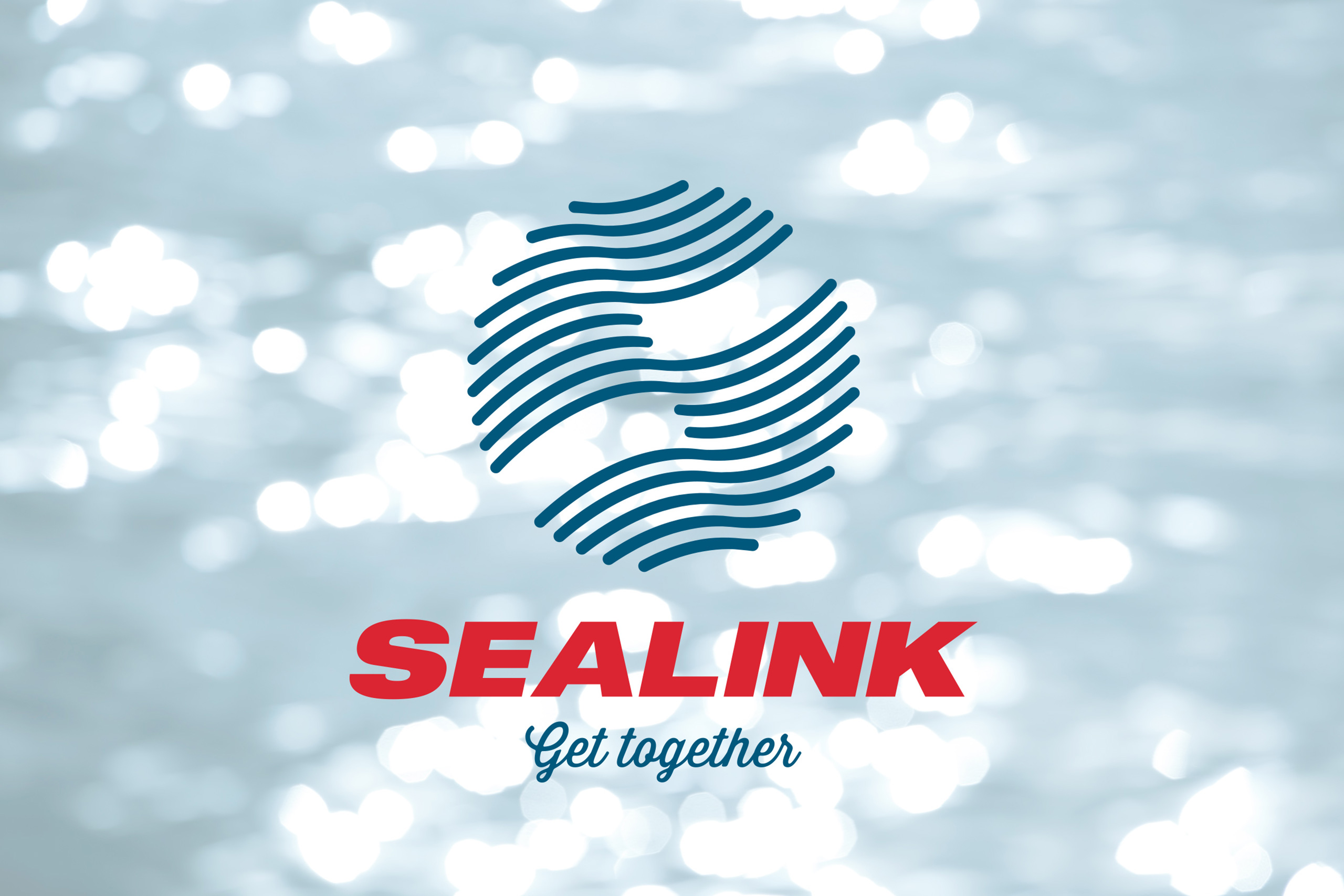
SeaLink
SeaLink
Wakes on waves
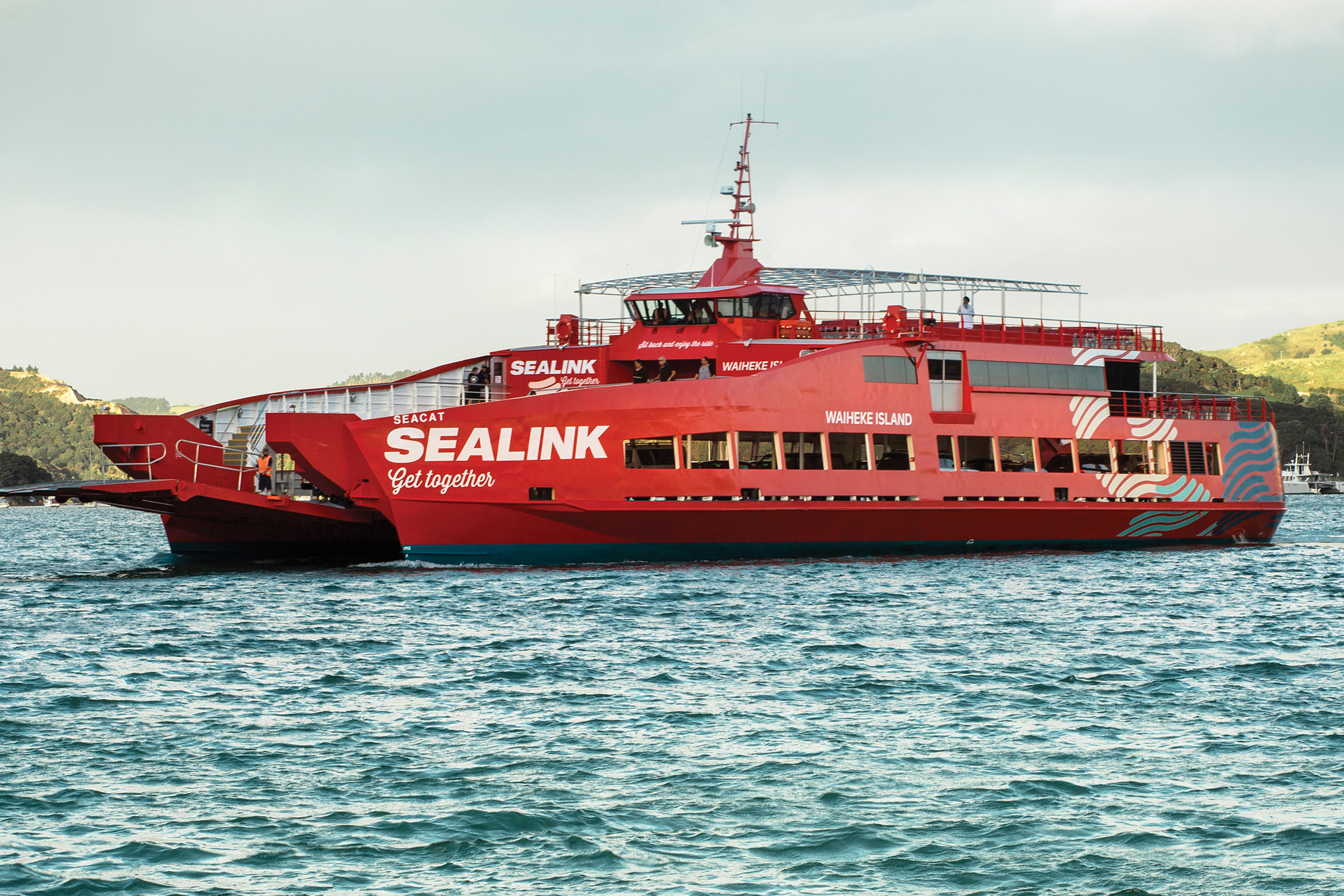
As we looked out the back of the Big Red Waiheke ferry, the wakes of three SeaLink vessels remained criss-crossed on the surface of the Gulf for a brief moment. It was the beginning of a new story.
Staff workshopping and customer deep-dives put into sharp focus the role that SeaLink plays in a thriving and ambitious Gulf economy. A lifeline for Barrier residents, the key to trade for Waiheke and mainland businesses, and even a lifestyle pass for Auckland CBD workers commuting from Maraetai.
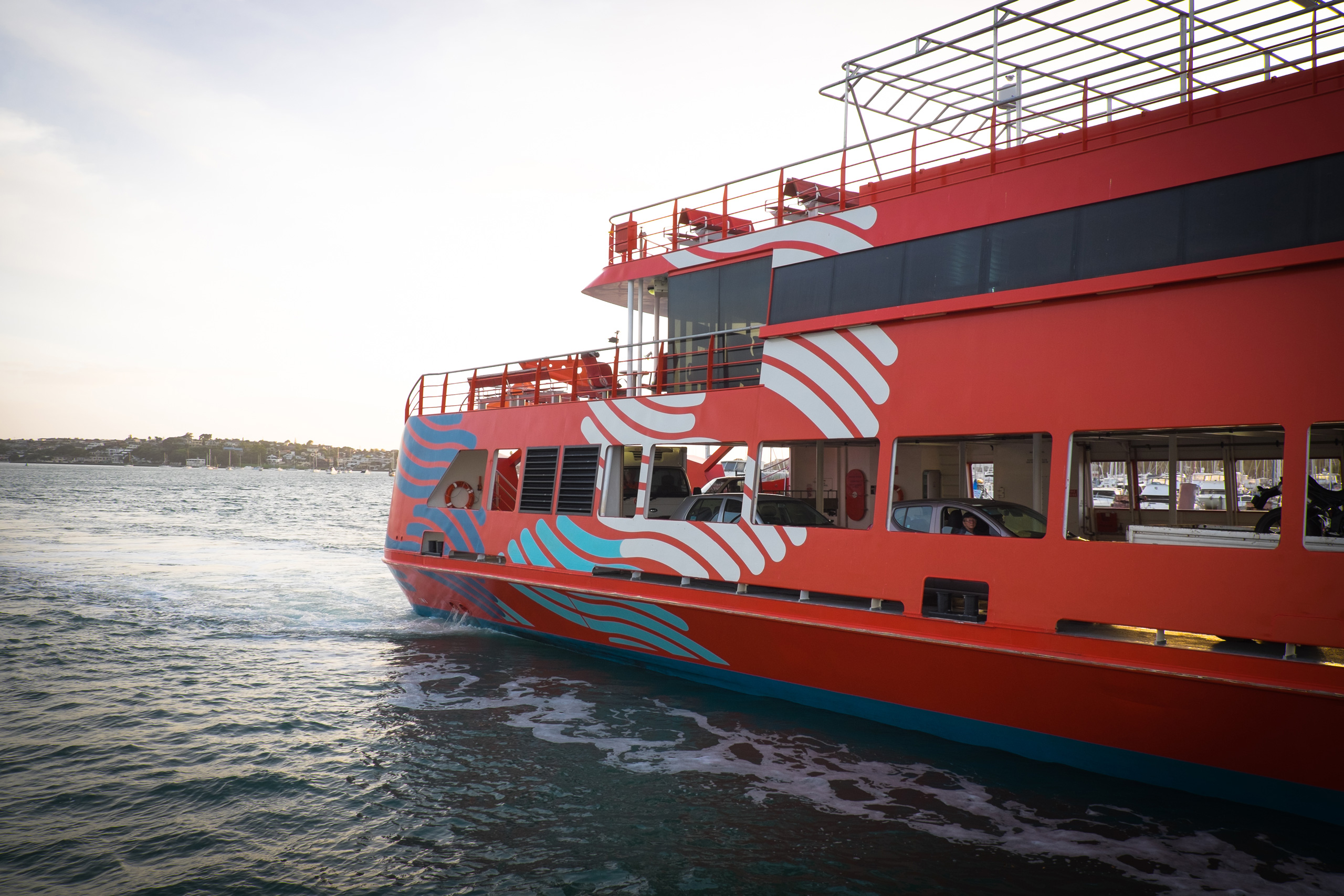
The new mark borrows from the fluid and direct routes plied by the ferries – the big ones and the small, high frequency commuter vessels. Meanwhile the logotype portrays a resilient and dependable aspect of the Gulf’s infrastructure and claims red as a proprietary identifier. The supporting script font serves as a conversational and holiday-spirited counterpoint.
‘Get Together’ fronts a story that encourages people – whether they be holidaymakers searching out new experiences, local families looking to reconnect, or businesses seeking new markets – to get to ‘the other side’ and make it happen. It also invites employees to work together to transform an effective operation into one of the best customer experiences on the Gulf.