Kaikaranga
Kaikaranga
Calling in a new era
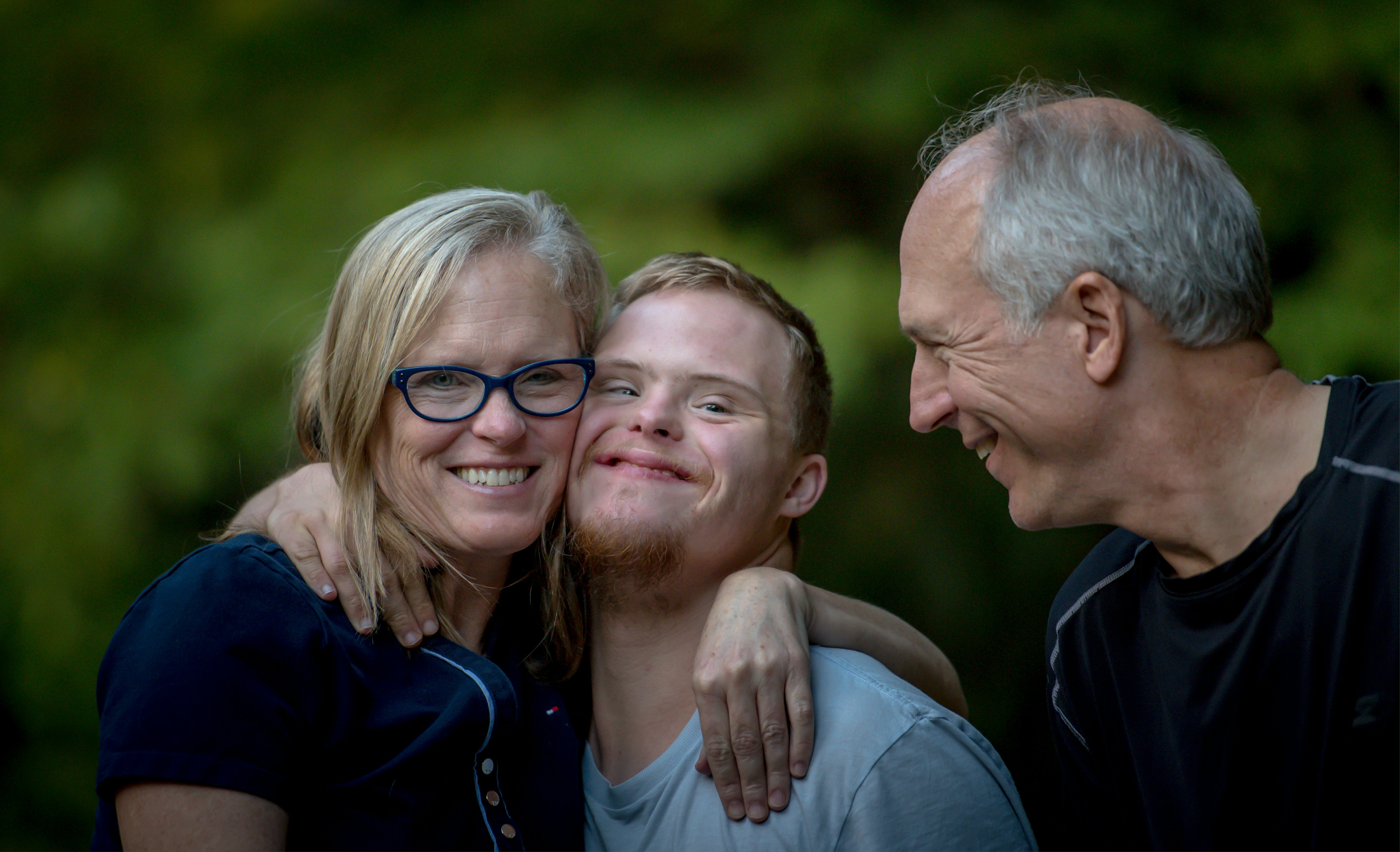
Following thorough research and strategy work, we respectfully proposed a new and compelling name – Kaikaranga – to help Auckland’s disability needs and service co-ordinator, Taikura Trust, evolve its identity as a broader, more wrap-around supporter for the region’s disabled people and their whanau.
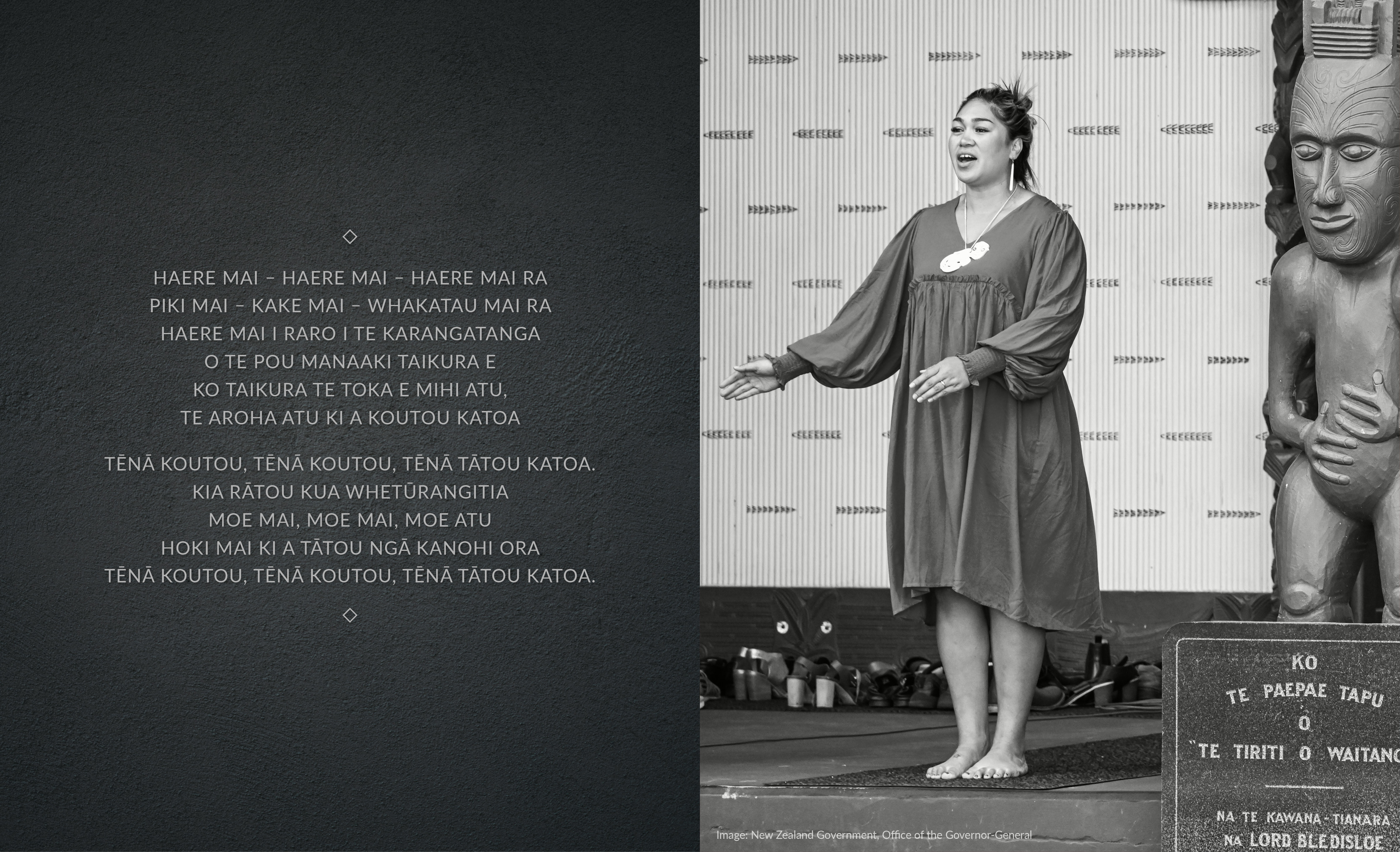
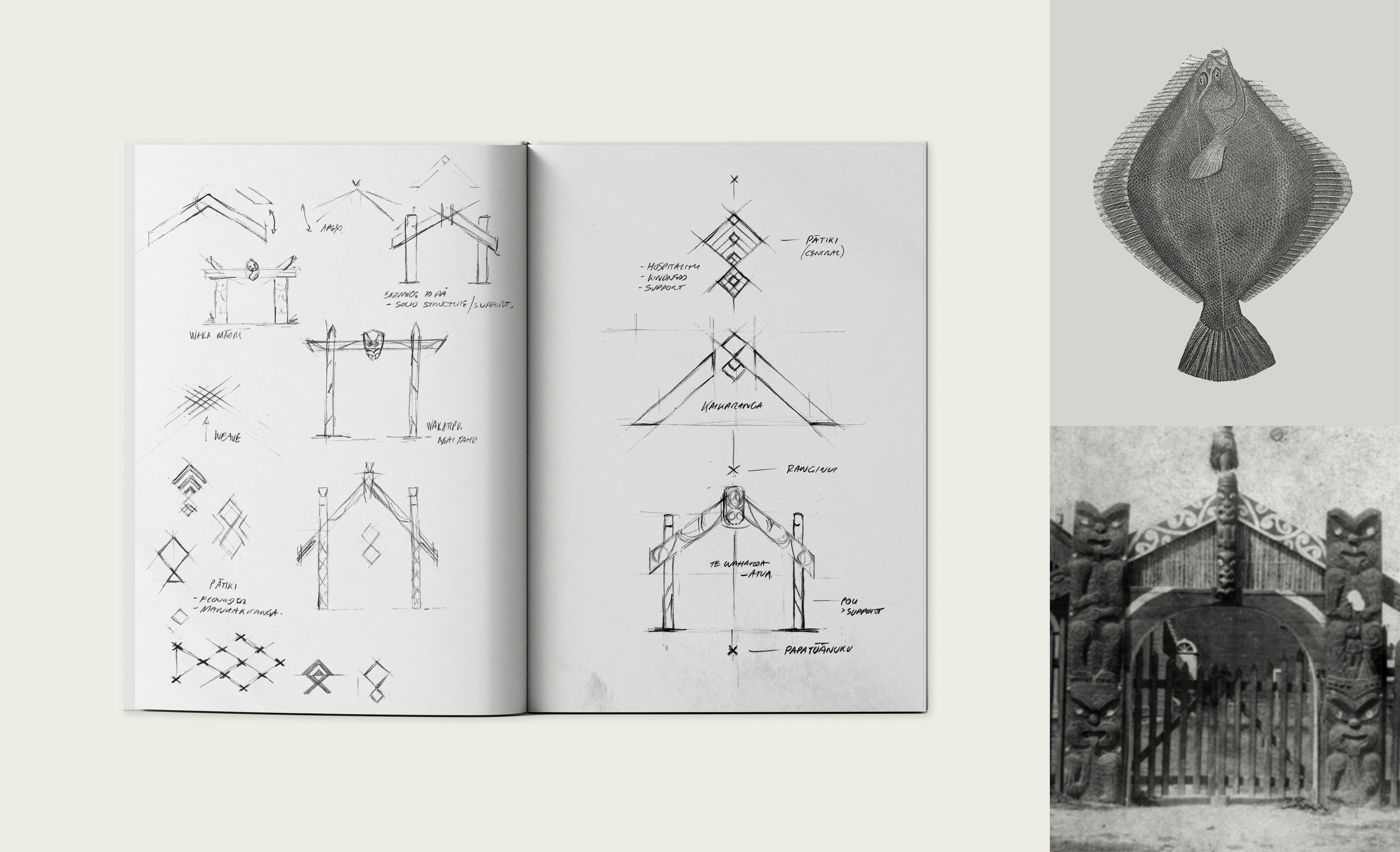
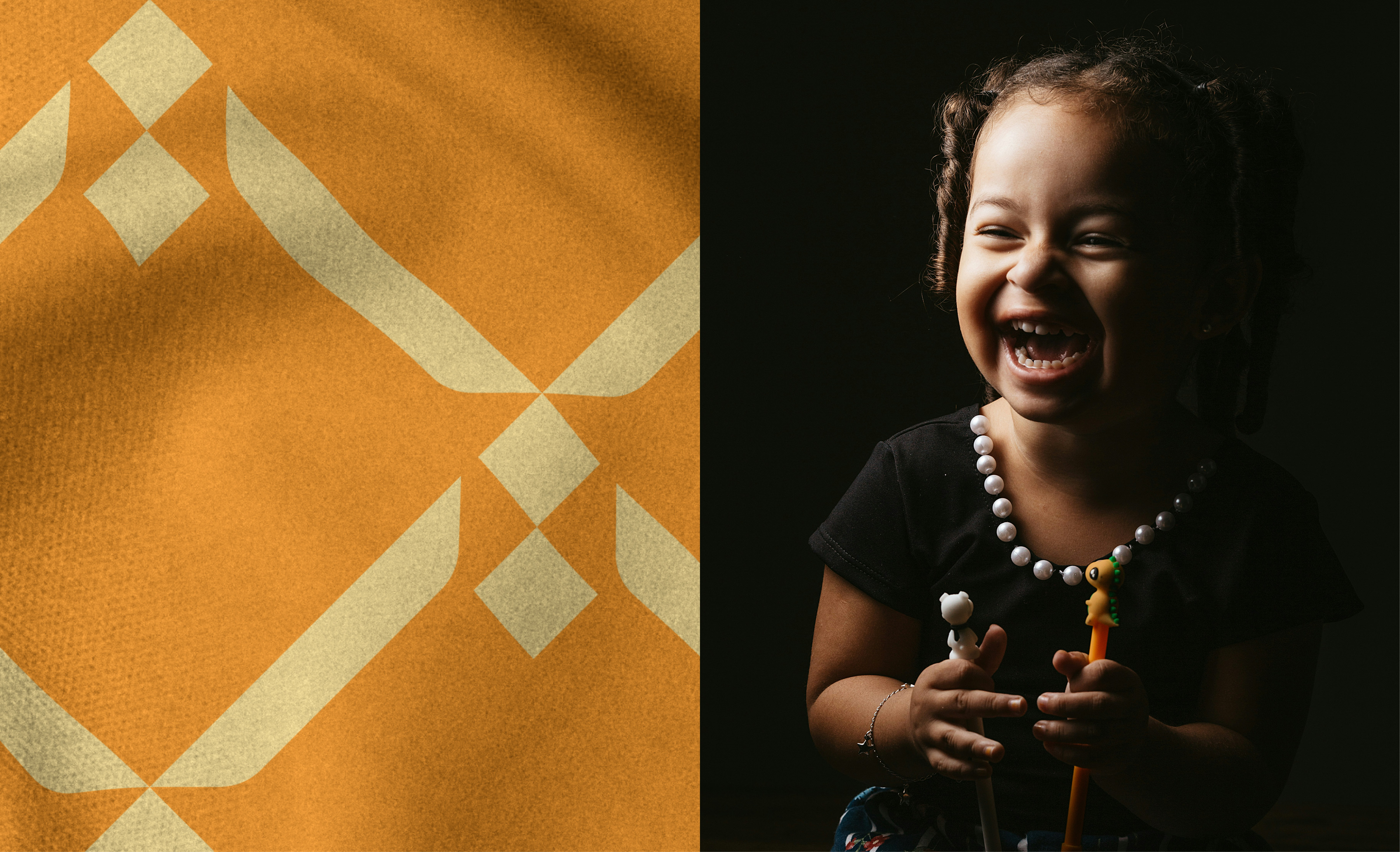
The kaikaranga is revered in te ao Māori. Hers is the first voice heard on the marae as she delivers the karanga – the welcoming call from the heart, that guides visitors to the safety and nurturing embrace of the wharenui.
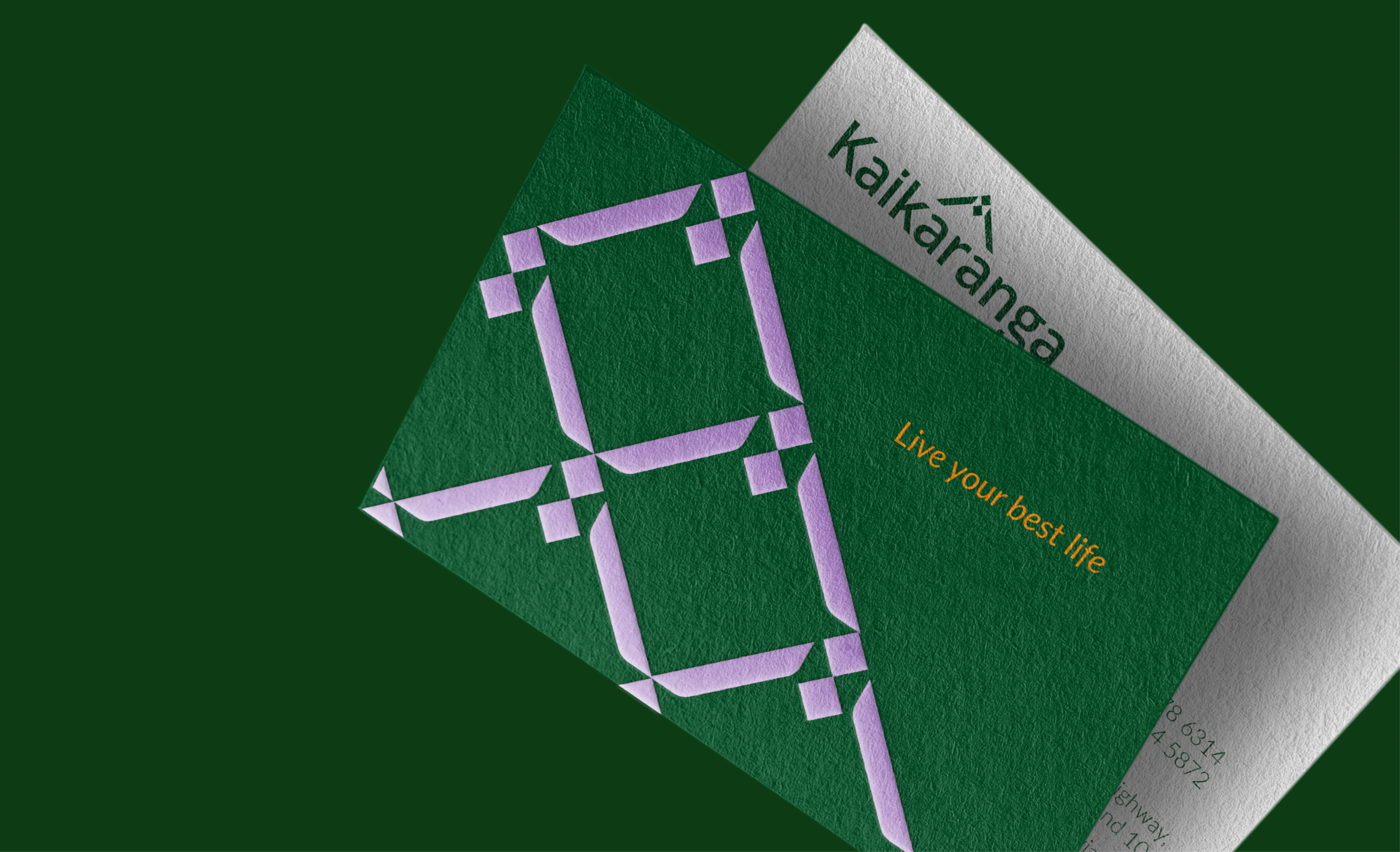
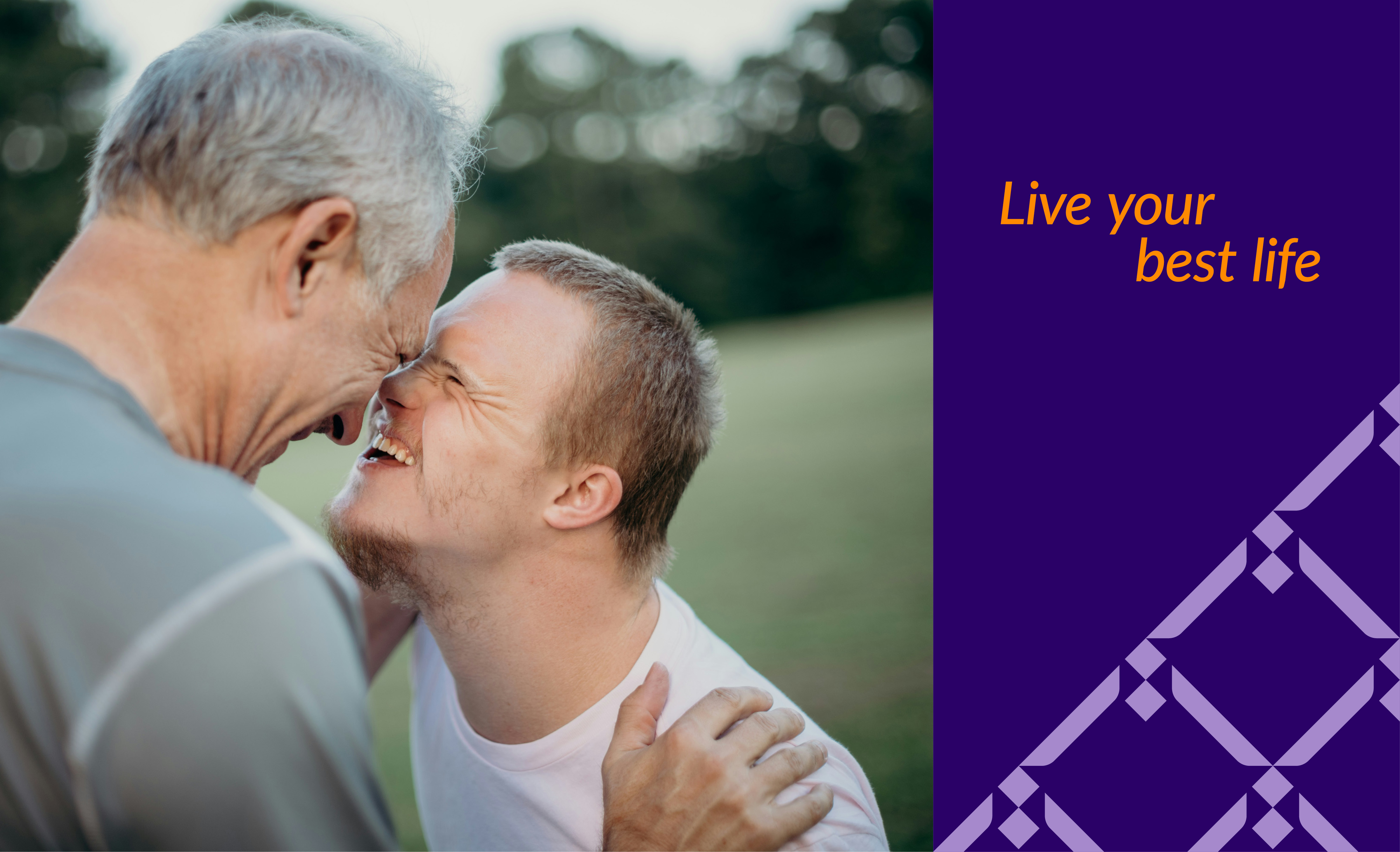
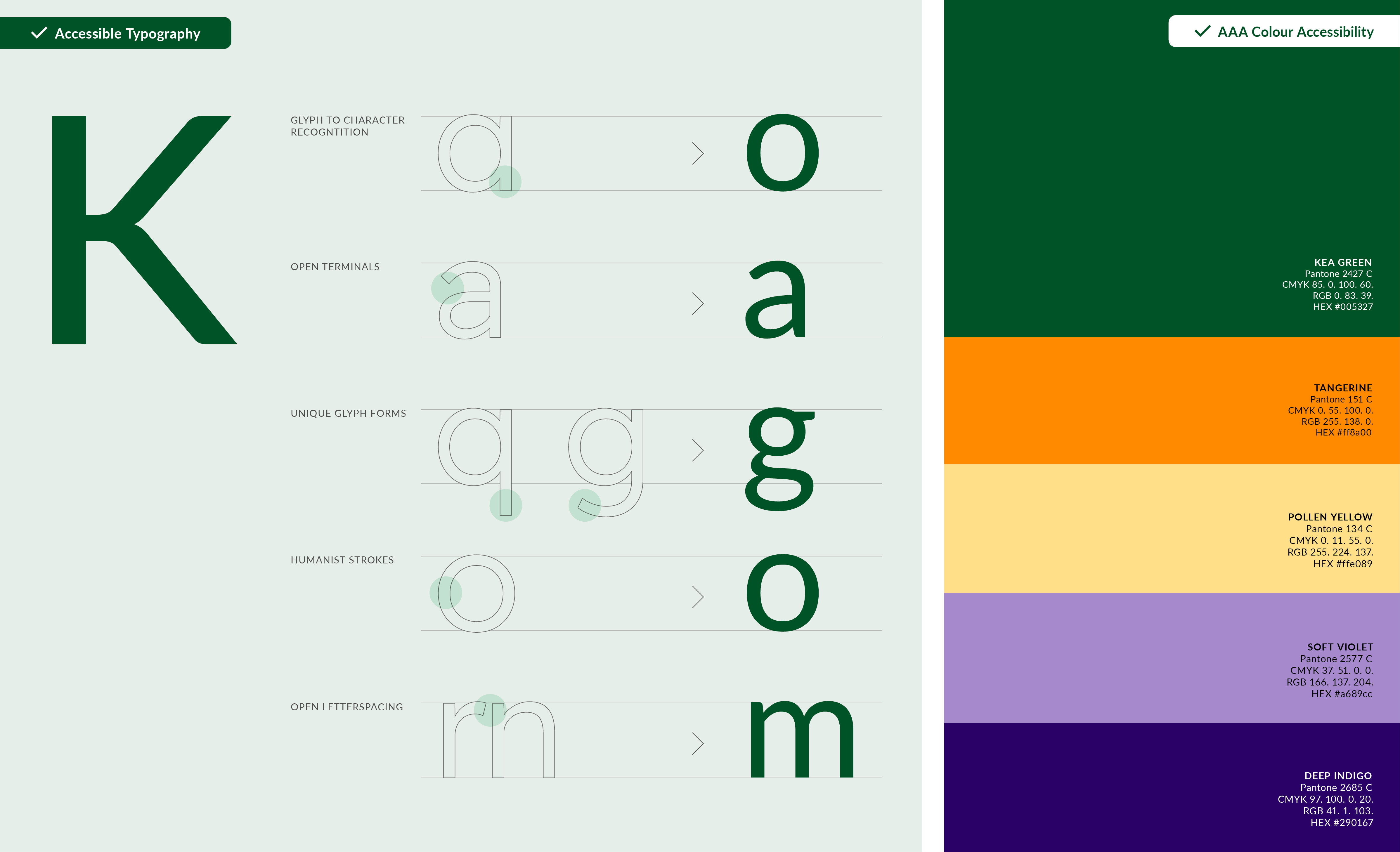
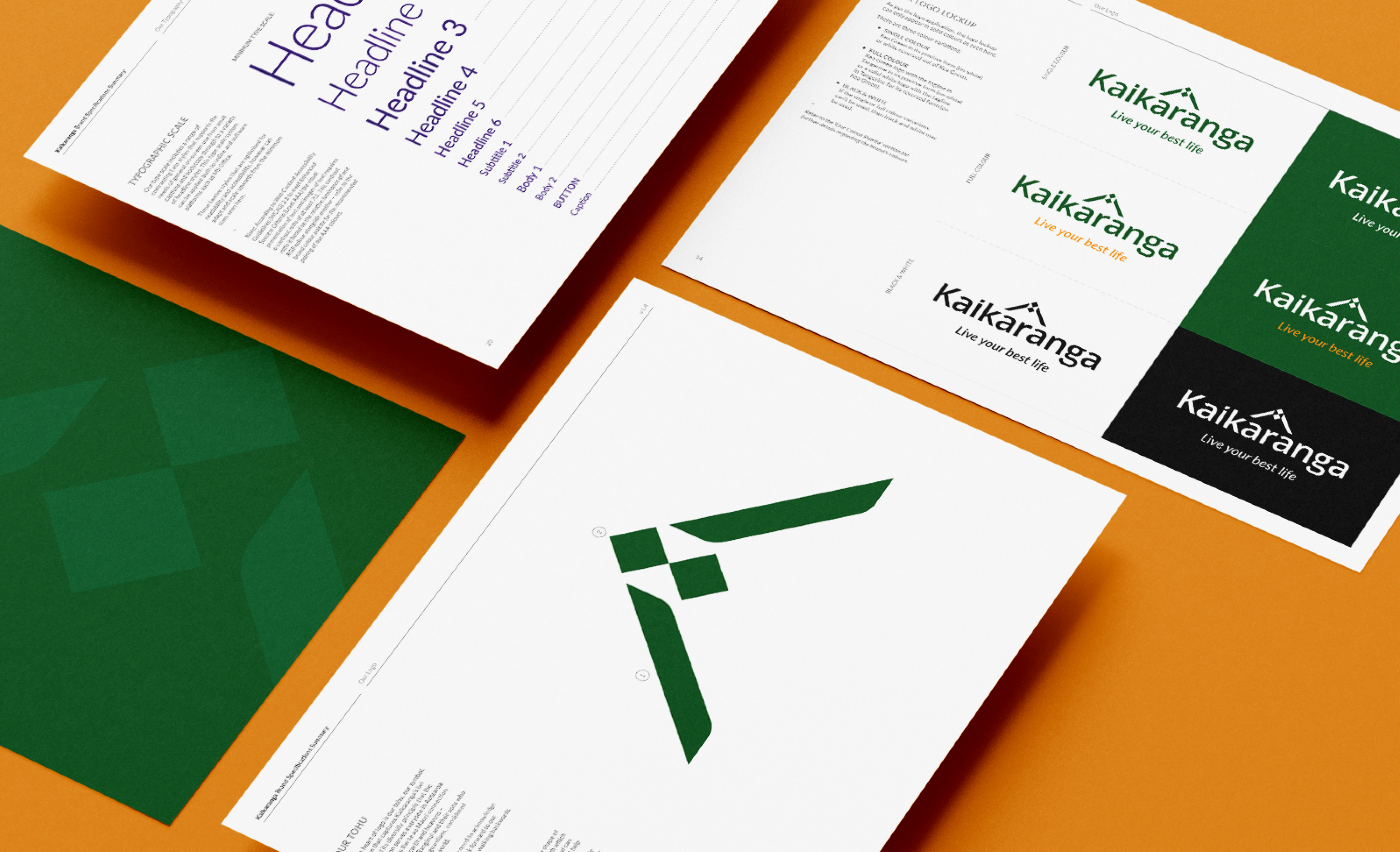
Representing the singular voice for people living with disability, Kaikaranga’s visual narrative reflects the warmth, openness and empathy of the female. The bold logotype, with its generous spacing and open letter forms, offers a welcoming friendliness while meeting accessibility guidelines.
The whare and its promise of sustenance and manaakitanga is also depicted as it respects the connection between the two worlds, physical and spiritual. The colour palette is based on a natural, reassuringly grounded green complemented by accent colours for vitality, optimism and positivity.
Altogether, a dependable and balanced identity empowering disabled people to live their lives on their own terms.